Colour is how we perceive the difference in the wavelengths of light. There are three primary colours of light, red, green and blue. At the heart of colour theory is the colour wheel, which was created in the late 17th century by Sir Isaac Newton. Best known for his physics breakthroughs, Newton mapped the colour spectrum into a circle.
Colour is about communicating, a subjective thing. It is not only about the overall look, there is the dilemma of sunny days vs overcast sky in a scene, using colour to enhance different environments and geographies, creating juxtaposition between scenes. Might be a warm and colourful film with the need to feel the environment, like the cold of the snow.
The colour graders can be embedded in the production process from production design, develop looks, lighting, compositing and output. Using many EXR passes, including lighting in order to have a high degree of manipulation and attention to massive amounts of detail. Start the grading in HDR wide gamut and then step back down for the deliverables.
Colour is either subtractive, where all the colours are absorbed and only black is reflected, such as lighting models in a 3D environment, or additive, where all colours are equally mixed together to form white, such as a computer monitor. The pigments absorb and reflect only certain frequencies of the light hitting them before it reaches our eyes. Black, all the colours are absorbed and only black is reflected. A computer monitor uses additive colour, mixing each colour with amounts of red, green and blue.
Warm colours are those in the magenta to red to yellow range and seem to advance from the frame.
Cool colours are those in the green to cyan to blue range and seem to recede into the frame.
Hue is the tint of the colour such as red, green or blue
Saturation is how much of that tint is part of the colour, higher values will give deeper colour. The higher the saturation the deeper the colour.
Value is the brightness from black to white with higher values being brighter.
Some things to consider are shadows, midtones, highlights, brightness, contrast and gamma.
HOW OUR COMPUTERS DEFINE COLOUR
All information is represented as sets of numeric values made up of binary numbers 0s and 1s, bits. In 8-bit colour file has a binary number range from 0 to 255, for each primary colour there are 256 possible combinations. With three channels 256 x 256 x 256 = 16.7 million possible combinations, RGB or HSV.
Why Color Space Matters: The foundation of accurate color
Color Palettes From Famous Movies Show How Colors Set The Mood Of A Film
Alexis Van Hurkman – Creating and Finessing
ANGELA CERASI | COLOURIST
 Fuelled by an obsession for meaningful imagery, Angela has colour graded hundreds of hours of documentaries, dramas and commercials for cinema, broadcast and streaming platforms. After a decade spent in large, cavernous grading suites in Dublin and Sydney, two bouts of maternity leave and an interstate move, she made the courageous decision to dive into entrepreneurship and start her own creative business.
As a colourist, Angela loves elegant colour grading that perfectly reflects the tone of the piece and enhances the deeper meaning of the film. It is her goal in every session to have a true collaboration; listening and understanding the heart of the story, exploring visual ideas and finding the optimum way to translate the message to screen. Angela prides herself on treating the footage with the utmost respect, completing the job on time and creating a calm and relaxing grade session.
Colourlab Ai: Artificial Intelligence revolutionizes color grading
Artificial Intelligence here, AI there. It’s everywhere, and while it is a marketing buzzword, it also reflects the changes AI brought to many industries. Color grading, for example, can benefit from Artificial Intelligence. One example is the now unveiled Colourlab Ai, a new color grading system that is poised to dramatically improve the process of color correction… thanks to Artificial Intelligence.
Color Management Part 6: Understanding the CIE 1931 diagram
Adobe Cool or Just Common? Blue is the Web’s Most Popular Colour
Adobe Colour Wheel
Why is color accessibility important?
Understanding color: A visual guide.
Adobe Why is color accessibility important?
Sapphire ColorFuse: Stunning Color Finishing inside Avid Media Composer
Color Management Part 1: The Honeymoon is over
Finding Impact Through Color: An Illustration Thought Process
Color Science, Explained (Part 1) Adobe By Bronwyn Lewis 07.20.15 Pro Video Coalition
Using LUTs and Powergrades To Streamline Your Davinci Resolve Colour Workflow
When working as a one-man band, you often need to take on all aspects of a production – this includes colour grading. Grading can be an especially time-consuming process. When building a look from scratch—and when you have a tight deadline to meet—you need a way to get your footage looking great as efficiently as possible, without skimping out and settling for a video that looks subpar in the colour department.
Learn precisely how to colour grade in this comprehensive new tutorial series
Blake Jones has been working as a colorist and film restoration specialist for over 27 years. Here, in the first part of a tutorial series, Blake lifts the mysteries behind colour grading, and precisely how to do it. In this part he looks at primary colour correction, which will form the basis of all your subsequent picture adjustments. In the first part in this series of Basic Colour Grading, we’re going to start with primary colour correction. All the graphics we’ll show also feature the Parade Display scope so you can see what is actually going on in these corrections. Let’s start out with this log file of the lion. If we compare the image to what we see on the scope, we can see the effects of the log file. The effects of the log file can be compensated by adding a log-to-linear LUT, or we can simply compensate using the primary colour correction controls. What we are seeing here is the lift elevated, luminance compressed and the gamma curve expanded. VIDEOS
The Subtle Art of Colour Grading
Animal Logic Studios is widely known for delivering breathtaking VFX on films such as Captain Marvel and creating award winning animation for The LEGO Movies and Peter Rabbit. What you might not know is that the studio has an internal DI department weaved into their pipeline, somewhat of a secret weapon when putting the final touches on a film.
CineCast: Trials and Tribulations as a Freelance Colorist
Television is going through a(nother) Golden Age. With the influx of streaming companies to the entertainment sphere, there have never been more TV programs to watch than today. For colorists and online editors like Alex Parnell, this means ample work and incoming clients.
A Short History of Color in Film and Television
The beginning of the photochemical film process came in the form of still photography at the end of the first quarter of the 19th century (around 1826). It would be another fifty years before film began to move (the 1890’s) and another 30 or so years for television to begin its birthing process (1926). All of them were originally brought to you in spectacular monochrome.
The Electronic Side of Color Media
Film color evolved over the years from hand painting directly on the film frames to various photochemical processes. At first glance, it would seem color video burst on the scene fully formed in December, 1953.
Color is powerful. You can elicit different reactions and even influence decisions just by choosing certain tones.
However, that connection between emotions and colors can vary from one person to another because color responses are cultural. While those raised in North America may associate red with passion, those raised in South Africa might consider red to be a symbol of mourning. The fact that responses to hues may vary based on a viewer’s background means there’s more to explore when it comes to the connection between tones and emotions — and there’s more room to experiment.
To dip a toe into color psychology, let’s look at five color families and the emotions they’re best known to evoke.
10 Color Theory Basics Everyone Should Know
Most of us aren’t interior designers by trade and that’s okay. Whether you think of interior design as an enjoyable hobby or a necessary evil that helps keep your home looking presentable, sometimes it can be tough to understand the industry lingo. After all, how often do you hear about Tertiary Colors, anyway?
CREATING COLOUR PALETTES with CANVA
Is the resource that helps you in color selection, specially created with this aim; it is the generator of inspiration.
HAYMES PAINT
The Haymes Colour Library has been created to start conversations about colour and design based on personal interest and style
The Fundamentals of Color Management with Victor Perez
ADBOE | SPIN THE COLOUR WHEEL
From soft pinks to cool mints, color trends spread fast. Explore these fashionable hues and try them yourself to draw the eye and build an audience. Trends influence not only what we create and consume, but how we create and consume. And in today’s Internet-obsessed world, trends spread faster and wider than ever before. Using a fashionable color in your work can inspire people to share it with their community.
COLOUR CORRECTION & COLOUR GRADING Adeepo Beroi
Using Davinci Resolve, Color Correcting & Color Grading have become my dedication and passion.
Over 20 years ago I started my career in the Video & Film industry and since then I have worked in many fields such as as Producer, Director, Editor, Cameraman and much more. This experience gives me a cutting edge as I color correct and grade your footage.
Colors are my passions in life!
COLOUR SYSTEMS
ALBERS
Chemist Michel-Eugene Chevreul (1786-1889) identified a fundamental law of the simultaneous contrast of colors which detailed the effects that proximity between two colours has on what the eye sees, when observed adjacently, colours will influence each other.
Itten identified seven fundamental categories of contrast: hue, light-dark, cold-warm, complementary, analogous, saturation, and extension. The color star modeled several of these. It featured six concentric circles, representing the surface of Runge’s sphere, with twelve “meridians” radiating from their circumference.
Ostwald’s system provides a single, midpoint interpolation between adjacent colors. It does not have an easy way of recording millions of colors.
Using the simplicity of design removing decoration. Schuitema focused on the use of primary colours, applying narrow, bold, small or big letters and the use of asymmetry and contrast such as horizontals, verticals, and diagonals, juxtaposed.
COLOUR PALETTE
 BLACK PANTHER COLOR GRADING PALETTE
Despite its success the movie met with a lot of criticism. Then again, many great classics such as The Good The bad and The Ugly and films like Scarface all met with tremendous criticism when first released but over time they turned into timeless masterpieces. However, in this article we will focus on the colors, not the success nor the criticism.
Color Palettes are great and often used for filming (set designs), videos and even photography. When used in set design they are also great to use later in post production color correction and color grading. Adeepo Beroi

NEW YORK COLOR PALETTE
 THE YELLOW CAB. They have them in a couple of different yellow colors.
- The Yellow of course represents the cabs but also part of the dress and her shoes and traffic lights.
- The grey shades could represent the dull buildings and sidewalks or streets and even the grey weather.
- The blue could be blue jeans or other clothing pieces. Blue is also often in surrounding graphics.
- The red could be clothing pieces such as a red scarf or a car stop lights etc.
- Basically all the colors from the palette could be in clothing which makes it great because you hardly go wrong when using a color palette.
In color palettes you can always adjust the Saturation and Saturation but NOT the hue. Adeepo Beroi

TITANIC COLOR GRADING PALETTE
These color palette articles are for everyone interested in seeing how colors are combined to help tell the story in a specific scene and how these colors support the story being told.


The Color Grading Palette of “The GOOD BAD UGLY”
 Even though this movie like many, has been remastered, the color look is totally different from what is called the modern ‘Blockbuster Look’ (also referred to as the Teal and Orange look). How ever it does share the beautiful high contrast and the accentuated skin-tones, but notice that the shadows are not blue or teal and the palette has more of a nature look. Adeepo Beroi

MIAMI 1983 COLOR GRADING PALETTE
 The vibrant pastel color look as Miami in those years is well know for. Vibrant complimentary colors in which the skin tones play a leading role. Everything color this image compliments the skin tones. Adeepo Beroi
COMPLIMENTARY COLORS
Complimentary colors are colors directly opposite each other in the color spectrum and even though not as vibrant as the Blockbuster Color Palette, this Miami palette still uses the technique of complementary colors. The contrast of complementary colors creates a vibrant look especially when used at full saturation.


THE BLOCKBUSTER COLOR PALETTE
 This look is known for having cool shadows as well as warm skin tones and highlights, it adds a very nice color contrast to the image when applied correctly. Adeepo Beroi
THE TRANSFORMERS BLOCKBUSTER LOOK
Vibrant complimentary colors in which the skin tones play a leading role. Everything color this image compliments the skin tones.
Notice that in our Blockbuster color palette, yellow and blue are complimentary colors, they are opposite of each other (complimentary).

Also the orange (skin tones) and teal are complimentary colors, they are opposite of each other (complimentary).

You could say that the skin tones are the most important color in the palette. To support the skin tones even more, TEAL is added to the palette to emphasize the skin tones as teal is complimentary to orange (orange being the skin tone). This is also called the TEAL & ORANGE color grading technique.


COLOUR CORRECTION
How to Use and Read the Four Primary Video Scopes
When you’re color correcting and grading, it’s important to accurately assess your video signal. You need to know if you’re crushing the blacks in that night shot, clipping the whites in those clouds, and what exact hue and saturation that logo is. Your monitor may not be properly calibrated, so that can’t be trusted, and our eyes adapt to the image, so we can’t trust them either
PERSISTENCE of VISION
Understanding Color
RED GIANT delivers Production-proven special effects tools for digital video & film professionals. Plug-ins built for Adobe After Effects, Premiere, Avid, Final Cut …
Visual Storytelling Workshop with Simon Walker who explored how colour grading techniques are used in film and showed practical applications of how to create moods, suggest genres, and inform the audience of the motivations of on-screen protagonists – all utilising Red Giant’s Color Suite of plug-ins.
He included some practical ways to improve the look of digital video, polish and enhance motion graphics sequences, showcasing strategies for reducing pixelation and noise and production techniques for making your video look as good as possible, as well as how to apply fast After Effects style post-production effects from your editing timeline, using Red Giant’s Universe suite of Plug-ins.
- Explore how colour grading techniques are used in film
- Learn how to create moods, suggest genres, and inform the audience of the motivations of on-screen protagonists, using Red Giant’s Color Suite of plug-ins
- Get practical ways to improve the look of digital video, polish and enhance motion graphics sequences
Why do we tells stories with colour, colour correcting, how are colour grading techniques are used in films, do we need all that dialogue or do we save money shooting at a particular time of day. A shot may be 2 to 4 seconds and it can be shorter with colour telling the story. The audience anticipate what is going on in a particular shot and colour can communicate the story making the shot shorter.
Think about the colour wheel, rgb light and when replacing a colour you move the opposite or complementary colour.
We cannot trust our eyes as our brains reinterpret some of the colour. With complementary colours that work together our eyes are more attracted to the image, more pleasing for the audience.
Visually when we look at a blue dot on white paper for long enough then look at a blank white page we will see the complementary colour.
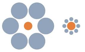
two circles the same size
surrounding colours change other colours

the brown dots shown are the same colour the shadow and neighbouring colours affects the colour
Colour changes throughout the day, during a story and how it is interpret.
How do our eyes see colour, in low light conditions our eyes see different colours. With the light becoming less and less saturated there is less movement and everything goes black and white. The brain is saying there is not enough light to interpret colour and puts the light into interpreting detail. We need to factor these things into grading to be convincing to the audience.
Colour has different physical wave lengths with blue being shorter than red and green.
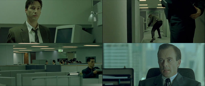
Consider orange and teal in movies. In the Matrix where different locations or environments are associated with different colours and temperatures. There is the real world and the computer world which is more stylised which we get used to over the duration of the film.
What do the colours mean, they are associated with different locations giving more meaning. We make the different colours and manipulate the colour to tell the story. How can it change the story, what are they thinking, communicating with colour. This can change, there are no rules, do you craft every pixel or use presets or somewhere in between.
The Cinematography of “The Matrix” part 3/3 – the colour palette
Every frame being designed to have the audience look at a particular thing in the image. Consider increasing highlights and decreasing shadows.
When the contrast is increased the rgb colour space gets a perceived saturated change looking unnatural. Could put the shadows to blue, reduce saturation and use a vignette.
Vignette – cause the audience to look at a particular thing in every frame, attention getting device.
Why is the sky blue? Different wavelengths of light are scattered by the atmosphere and the blue wavelength is shorter than the others and scattered differently. This is the physics of the blue sky and when we look up there is more atmosphere at the horizon it is whiter or lighter. The blue wavelength and it is scattered differently by the atmosphere, it becomes a gradient.
Images can be enhanced with grading and when it is the wrong colour the audience might not know what it is though they recognise something isn’t quite right.
Distance including city landscapes, the distant buildings have a more blue/purple colour which is an optical illusion. To enhance space or depth in the image, a non-stereosciopie image, one way to put them in the distance is with more blue with objects in the foreground with less blue. Warm colours project forward, cool colours recede, the colour of light depends on depth perception. For white balance outside light is slightly blue and inside light is slightly yellow. This also happens in nature.
The physics of the colour of light only changes int he highlights, brightest forms of light. Consider colour correcting or changing in the highlights and when the mid-tones start to change it begins to take on a more stylised mode.
Reduced mid-tones affects the ambient light, could become earlier morning or later in the day as there is less ambient light then. The colours look saturated when working in rub colour space and maybe increase the contract to reduce the saturation and it becomes more realistic. We see blue more readily as it has a shorter wave length. For the later time of day we see more blue, maybe add some blue into the highlights and make the shadows darker, for it to look more like the evening. Sometimes is it cheaper to shoot during the day, there is more light and introduces less noise in the well lit footage. Then colour grade later for the change of time of day rather than low light conditions
There is the golden hour, in photography, or the magic hour, is a period shortly after sunrise or before sunset during which daylight is redder and softer compared to when the Sun is higher in the sky. The blue hour, or sweet light is the twilight each morning and evening when the sun is a significant distance below the horizon and the residual, indirect sunlight takes on a predominantly blue hue. This effect is caused by the relative diffusability of short blue wavelengths of light versus the longer red wavelengths. During the blue “hour” (typically the period is about 40 minutes in length), red light passes straight into space while blue light is scattered in the atmosphere and therefore reaches the earth’s surface. When the sun is below the horizon there is less ambient light and changes how the wave lengths are being filtered through the atmosphere.
What colour is snow, how it is changed in the Game of Thrones?
It is blue, higher contrast and the shadows are darker.
Colour is contextual, dependent on what is happening in a scene and movies use colour for different purposes such as yellow for danger in an environment and blue in the head quarters office which are safe. Different locations have different themes.
Red: attracting attention, strong, positive, drama
Yellow: happy, highly visible, possessive, good mixed with black such as wasp, call someone yellow
Orange: mix of read and yellow, more friendly, politics, conformist, happy
Blue: opposite to political, conservative, cold, open, emotionally detached, safe, not upset the client, optimistic
Green: nature, calm, relief, evil,nausea, because the wizard of oz was green now all witches are green, traffic light (isn’t red)
Purple: pompous, femininity, mixes with yellow, warmth, romance
Black and White: mixer colours, black neutral, mourning, depression, goes with red
White: sterile
Look at the colour of trailers and see if you can tell what kind of movies they are e.g. blue for sic-fi, green for horror, orange for comedy.
How do some movies use colour?
Skyfall uses warm colours in turkey, yellow in the dangerous environment, the hot location and cool in the head quarters. What is the colour of the coat in the cold location and then the colour of clothing in the head quarters is blue, they are emotional temperatures. They are telling an emotional story and we cannot always tell these are different locations so colours can be used to illustrate this in movies.
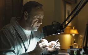
In the film ‘House of Cards’, the different locations, the White House is not overly lit, greyish, neutral and two characters have different relationships having general conversations. In the restaurant the two characters are having another conversation, the background is warm, they have with shirts but is at odds with what they are talking about, they are not the best of friends.

Are the lamps white or yellow, are they best friends? The set design sets this up, it could be a costume moment. For clinical thinking the lamps are white and the environment is sterile. What is this information telling the audience?
 Increasing contrast as well as saturation it makes it more dynamic, the image is more attractive to look at. If there is low contrast this changes the perception of what is happening.
The low contrast evokes a sense of intimacy, the telling of a specific story, a mystery. The painter stick to bring our attention to small details will sometimes put small bits of colour flying through, almost irrelevant and attracting our eyes, complementary colour on different corners.
Low contrast and grain for mystery, high contrast is in action movies.
Red Giant’s Mojo for colouring effect such as warming up actors skin tones, adding a cool blue to the backgrounds and shadows, adding drama, or smoothing contrast.

Particular films have their colours such as Sci-fi films, the shadows and midtowns are teal/blue. Skin colour or tones have some element of orange giving a contrast of skin to the bluish background. The buildings and gloves are coloured blue with the balancing colours and throw these colours into the shots at certain points
There are no rules, is his skin tone accurate?
Used comic book colours
Why is green bad? At what point in the movie do we know it is a horror film. ‘Drag Me To Hell’ goes from neutral to green in the car park. Do white lights project a green background and skin tones?
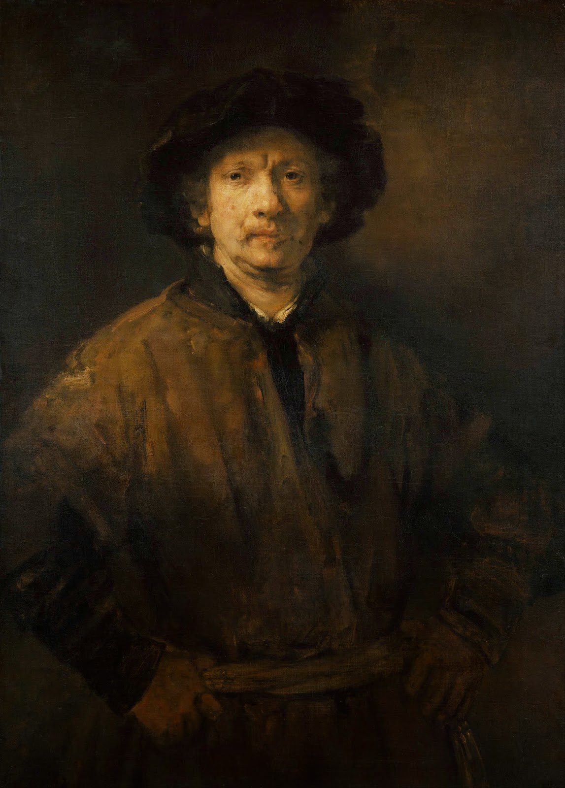
This is not only to do with movies, the great artists have done it, Rembrandt and Rubens. The used the strong contrasts of dark and light, chiaroscuro. The detail on the face and hands with the viewer being attracted to the areas they wanted them to look at. There is fine brush detail in these areas with the use of white and the eyes are in shadow. Rembrandt was a humanist and wanted to bring out their story, to make you consider what his is thinking or hiding, using a vignette.
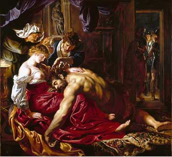
rubens – samson and delilah
The soldiers are lit, there is the use of rich colours of purple and red and the eyes are drawn across the picture. The attention is focused onto different areas.


hopper – nighthawks
Hopper uses texture, a gritty feel and has oranges and greens.
These techniques are hundreds of years old
Teal and Orange – Hollywood, Please Stop the Madness
