3D TEXTURING PROCESS DIARY
Texturing is the process of applying the surface qualities to objects such as colours and texture, assigning 2D images to 3D objects.
Notes from Lanier, L., 2011. Maya studio projects. Texturing and lighting. Sybex, Indianapolis, Ind. p123
UV snapshot and bitmap texture resolutions of 512, 1024, 2048 are resolutions commonly used in animation and stem from the historical use of binary-based computing. 1024 is 2 ^10 or 1K and is the number of bytes in a kilobyte, 512 is half and 2048 or 2K is double. 1K and 2K refer to the number of horizontal pixels carried by a render resolution, film scanner resolution or digital projection resolution. The render resolution of 1024 x 768 is 1K with a 1.33 aspect ratio, the resolution wider is 1.33 times greater than the height.
Lubitel Camera 166 – Texturing in Mari
Exploring texture in architecture: Types and uses
Iguana
ChaosTV – Download Twinbru’s free fabric library on Chaos Cosmos
3DRedBox – Texturing A Shawl In Substance Painter
Alvaro Conejo Portfolio Entry 2025
食梦龙崽DragonFly art 2025 portfolio
Dug from Pixar’s Up
UTILITY NODES and SHADNG NETWORKS
2D and 3D PROCEDURAL TEXTURES – Maya provides a number of textures that are procedural. A Procedural Texture is one that is mathematically generated through a predefined algorithm. Procedural textures are resolution independent and do not have defined edges or borders. The textures fall into two categories: 2D and 3D.
Textures can be blended in Maya in many ways including using a Layer Texture or Layer Shader. When a mask is not available a Stencil utility can masks a particular colour.
SCIENCE DIRECT – Procedural Textures
Each node has an input and output linking them together to create surfaces to represent images and creating textured environments that can be blended to create shading networks resulting in the ultimate image. In Maya the Hypershade is used to create and edit materials, textures, rendering utilities, light and other special effects creating Shading Networks.
Maya’s surface materials include Surface, Volumetric and Displacement each with its own unique attributes including Colour, Bump, Specular, Transparency and Reflection. In the Attribute Editor when there is a Colour Box for an attribute this means that the attribute uses an RGB Channel meaning that the colour of the texture will be portrayed. Colours for attributes that have a value field will not be portrayed, only the value is effective. Most attributes have a value of 0 referring to black and 1 referring to white. In a basic colour system, each colour has 255 levels and in such a system, grey is protrayed in a 255-level gradation but in a shader this attribute is portrayed from 0-1 with 0.5 being 50% grey.
In Hypershade, almost all values are between 0 and 1 eg Diffuse when it is 0, the image will be black, when it is 1 the image brightness considerably.
Connections between nodes such as surface, materials, textures and utilities which are used to shade objects and are evaluated to render the scene.
MATERIALS are sets of instructions that describes how the surface of an object will look when rendered. It includes attributes, texture maps, mathematical descriptions of how light will behave. Maya contains several types of material nodes that help you simulate the real-world qualities or behaviours of surfaces to light: Surface material nodes, Volumetric material nodes, and the Displacement material node. They calculate the surface characteristics and determine how the surface will be shaded.
- surface material is used to shade surfaces
- volume material used to shade volumes such as fog and some particle types
- displacement material is used for displacement mapping surfaces
LIGHTING – how do the object’s highlights appear, how the various ways light fall across the surface. The light reflected at a consistent angle results in an intense bright region, specular highlight and the scattered light which is absorbed by uneven surfaces is diffuse light. Light reflected from a surface gives the sense of colour when a lot of light is scattered the surface will look more saturated. For specular if the light rays are reflected at close to the same angle, a tight highlight results. If the rays are more scattered, a bigger and softer highlight will result.
- cosine power affects the size of highlights on the surface or shininess
- roughness and highlight size work together to affect the size and look of the highlight
- eccentricity affects the size of highlights on the surface with very shinny surfaces having a small and strong highlight
- specular roll off allows surfaces to reflect more of their surroundings considerin glancing angles
UTILITY NODES – Utilities let you add extra effects to your scene. For example, you can use the utilities to sample light or surface property information, convert a 2D or 3D texture to bump maps, or multiply/divide or add/subtract input attributes. You can also blend colors, increase or decrease contrast, or remap scalar or color values, and so forth.
CREATING A SHADER for MAYA in ARNOLD
GAMMA CORRECT gamma refers to the light and the relationship between the luminance that is seen on the monitor in response to a video input signal. Not all device outputs produce realistic images. This utility adjusts the Gamma value of each RGB channel. When the RGB value is set to 1 there is no effect on the image.
CONTRAST adjust the contrast of the Color Maping the RGB channels. Controls the amount of contrast adjustment. You can adjust the contrast of the R, G, and B components individually. Increase Contrast to make light colors lighter, and dark colors darker. Decrease Contrast to make everything gray. Bias Controls the middle point of the contrast adjustment. Increase Bias to move the middle point upwards (more of the texture becomes dark as contrast increases). Decrease Bias to move the middle point down (more of the texture becomes light as contrast increases).
LUMINANCE makes the 3 RGB channels into a luminance channel, converting the colour to grey. The value field instead of a colour box can also be used to make textures such as a Bump with a precise value and be linked to Diffuse and Glow Intensity.
SURFACE LUMINANCE deals with the relationship between the light and the surface Normal. When using a ramp when changing the direction of the light the colour follows the light. With a ramp range of 0-1, Color 1 facing the light and Normal will be displayed while Color 2 displays the surface where the light is perpendicular to the Normal.
HSV to RGB and RGB to HSV
2D and 3D PLACEMENT automatically created texture nodes are created. Generally determining how the texture will be arranged in the UV-axis, where and how big rotation for 3D. A single node can be used for the Placement attributes for several textures.
BACKGROUND SHADER important for compositing, to mask other objects behind it by using a background colour
ANISOTROPIC surfaces with micro facet grooves when the specular highlights tend to be perpendicular to the direction of the grooves could be CD’s, ornaments, hair, knobs, padlock, saucepans, blades, feathers, fabrics. Represents surfaces with grooves, the appearance of specular highlights on an Anisotropic material depends on the properties of these grooves and their orientation.
SHADING MAP can remap the output from a material to create custom shading results to control the final shaded result to go beyond what is possible with standard materials. Gives complete control over the transition from the highlight to the shaded area of a surface. Shading maps work like a post process: the regular shader computes a colour for each point on the surface, then the shading maps shader replaces this colour with another colour. This mapping is based on two things; the brightness of the original colour, and the hue of the original colour.
LAYERED SHADER can be used to layer materials or textures. Are different material types on different areas of the same surface needed or is there a need to see different materials at the same time. Reads left to right, check which areas and shaders for specular, uses transparency and combines the attributes of various shaders to produce one final result.
SAMPLER INFO NODE to create a variety of different shaders including the attributes Facing Ratio (Produces a value that varies between 0 and 1 depending on the angle between the surface normal and view direction) and Flip Normal (Turn on or off depending on whether the object is textured differently on either side. The flipped normal attribute indicates if the surface normal is flipped which also tells you which side of the surface Maya is shading.).
When connecting the Facing Ratio to the Transparency value of a shader the transparency value is 0 or black it appears opaque and when the value is 1 or white it appears transparent. Another example with the Facing Ratio connected to Diffuse, areas where the camera and the Normal coincide will appear brighter and areas where they are perpendicular to each other will appear darker.
When the camera faces the Normal of the surface the Normal value is 1, when perpendicular, the Normal value is 0. The relationship between the camera and the Normal of the surface.
CONDITION NODE offers options in which shaders are created using conditions. When linked to Flip Normal of the Sampler Info Node it can create a surface with different textures on both sides. Displaying different textures in the normal and anti-normal direction of the surface. Link the Flip Normal of the Sampler Info Node to the First Term of the Condition Node > link one texture to Condition Node, Color if False which will be on the anti-normal surface > link another texture to the Condition Node Color if True which will be the surface in the Normal direction. Then link the Out Color of the Condition Node to the Color of the surface node eg Blinn. Changing the Condition Node’s Operation in the Attribute Editor from Equal to Not Equal will flip the outside and inside textures. Can use different shaders for each surface eg Blinn and Lambert then combine with a Layered Shader.
REVERSE UTILITY can give the effect of more luminance and less transparency
REVERSE UTILITY reverses a given input value eg 0 to 1 eg Checker Node directly into Transparency then the same Checker Node into the Reverse Node that is connected to the shaders Specular Color.
SET RANGE acts to reduce the entire range and CLAMP NODES cut out a section of the range changing the attribute values given to a shader. One acts to reduce a given range and the other allows the use of a specific range within a given range. Out Alpha is the value that only calculates the luminosity of the colour, Luminosity is a measure of how bright or dark a hue is, luminosity is often measured as a percentage, ranging from zero (black) to 100% (full color).
STENCIL UTILITY creating softer edges by blending the edges of the texture, Edge Blend attribute. The mask attribute is where the texture used is specified for the mask usually being a black-and-white image. The white areas will be cut out and only the black areas will remain as the image. Change the alpha channel colour in the Attribute Editor > Color Balance > Default Color, can also consider placing a texture here.
HSV Color Key Attribute allows for the use of a specific colour as the mask. Color Key attribute colour. Hue, Saturation and Value Range correspond to the ranges for colour, saturation and luminosity respectively. Instead of using a File Texture in the Image attribute use a Ramp Texture with colours eg red, blue and green > choose the Ramp type. Turn Key Masking, On > select a colour in the Color Key attribute with this colour disappearing due to the mask. Hue can be used to determine how precisely the selected colour will be masked with the lower value meaning that only colours close to the selected colour will be selected, Saturation the same and Value determines the luminosity range, again with a lower value referring to a narrower range. ranges to adjust the colour range.
RAMP SHADER extra control over the way colour changes with light angle, brightness or viewing angle (facing ratio).
BLEND COLORS the lower the Blender value the closer to the Out Color will be to Color 2, the higher the value, the closer to Color 1. Can add a different texture to each colour and animate the Blender value.
MULTIPLY DIVIDE multiplication and division on the Input values.
PLUS MINUS AVERAGE gives the sum, difference and average values.
VECTOR PRODUCT multiplies a vector by another vector or by a matrix. The Vector Product node has three parts—two input attributes, an operator that you apply to the two input attributes, and an output attribute that holds the result.
ARRAY MAPPER applies and automatically creates an Age Map on the particle. Maps array attributes to the color attributes of texture nodes. Used by particle objects to invoke color values from the texture node for each particle.
UV CHOOSER automatically creates when several UV sets are made. This node is automatically created by Maya when you connect UV sets to file texture nodes using the Texture-centric or UV-Centric UV Linking Editor. It controls which available UV sets on an object control the surface placement of shader channels mapped to file texture nodes. Because this node is automatically created by Maya, you should not manually create it and adjust the connections.
LIGHT INFO is used to determine the position and direction of the light and the distance between the light and the Shading Point. Similar to the Sampler Info node, Light info provides light information instead of surface property information. You use the Light Info utility node to obtain information about the position of a light relative to a texture. As each point on the texture is shaded, the attributes of Light Info can determine the precise distance from the light to the point being shaded.
INTENSITY CURVE of the Spot Light. An intensity curve or an expression can be used to control decay. You can also create a custom brightness decay rate using an intensity curve. You can edit curves in the Expression or Graph editors.
SWITCH UTILITY – TRIPLE SWITCH Can create shaders with several textures of the same material such eg multiple surfaces, patches. Single Switch in the Switch Attributes section to add, remove, and map textures to objects such as bump or diffuse. Double such as UV. Triple such as Color, Transparency or Ambient with RGB. Select surface in the Outliner and connect in the Attribute Editor with different surfaces being connected to different textures such as Checker, Bulge, Fractal, Grid, Noise, File etc.
Using the Tripple Switch Utility Node in Maya
Common surface material attributes
DIFFUSE – Diffused light is a soft light with neither the intensity nor the glare of direct light. It is scattered and comes from all directions. Thus, it seems to wrap around objects. It is softer and does not cast harsh shadows. One example of diffuse light is sunlight that comes directly through a window in a home, but where the window is covered by a light curtain (usually white) that softens the light.
In shaders the lower this value, closer to 0, the darker the Diffuse colour, the higher this value, closer to 1, the brighter the Diffuse colour. Dark textures have darker Diffuse colour and white textures would have a brighter Diffuse colour. Diffuse maps using a Ramp Texture with a grey gradation can be used to create variations and more realistic surfaces.
GOLOR GAIN – a color multiplier for the texture, adjusts the white level (highlights), effecting the highlight areas of the image. Brighter colors become darker or brighter – the brighter the color the stronger the difference, blacks will stay the same. Will control much of the strength of the brightness and transparency. Colour Gain attributes on the textures will control much of the strength of the Brightness and Transparency.
Color Offset – Adds this color value to the texture.
Alpha Gain – A multiplier for the texture alpha value (your texture needs an alpha channel unless you have selected Alpha is Luminance)
INCANDESCENCE – emits its own light and portrayed in colour in the attributes. Black has no Incandescence and white is full value Incandescence. A Ramp can also be used to gradate the Incandescence value on the surface.
TRANSLUCENCE – gives the material the ability to transmit and diffuse light. Light falling on a translucent surface is first absorbed beneath the surface, and then diffused in all directions. This attribute can be applied to a map eg veins of a leaf which are thicker and do not permeate light, set to black and used in the Translucence attribute.
MAPS – Bump to make a difference in the surface texture adjusting the brightness and contrast of the grey scales. Specular using different colours and based on the Bump Map to further highlight areas, brighten areas illuminated by light. Colour the areas that will be illuminated for Specular red.
PHOTOSHOP – make an empty layer > Blend Mode to Multiply > Opacity to 35. Set Foreground Colour to black, paint over the reflections as it is set to Multiply the 2 layers will overlap only in the bright regions thus removing most of the reflection. Multiply, the coloured top layer is blended into the bright areas of the lower layer.
FRUIT BOWL TEXTURES using MUDBOX, PHOTOSHOP AND MAYA
APPLE
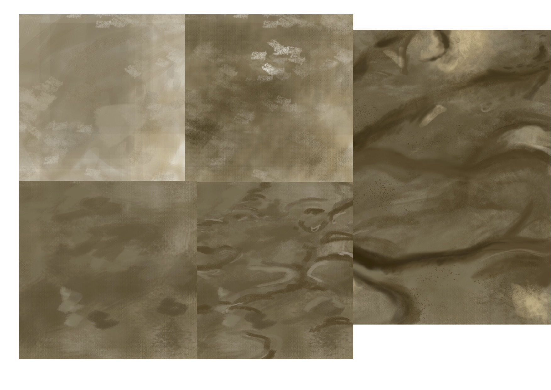
I started by creating white shapes and marks in photoshop to use as stamps in Mudbox to make the stripe and dot colours on the apple. The white area of these shapes allow the colour to come through on the surface of the apple model being painted. When using these custom stamps in mudbox and adjusting the settings I was able to vary the size, strength, length, spacing and randomisation values of the shapes and strokes as I built up the diffuse colour of the surface.

some dot shapes created in photoshop

dot and line shapes from photoshop in mudbox

stamp made in photoshop

stamp made in photoshop

stamp made in photoshop

testing shapes and settings on the stamp in mudbox

As in photoshop, mudbox uses layers, different layers were used to create the base colour, more refined colour, then the different coloured stripes and the dots.

stripes and dots applied to the diffuse layer
I looked at creating darker areas of the diffuse, being the darker colour on the apple by using a black and white image. Where the colour came through the white area and then by adjusting the weight on the shader I was able to use the black areas to darken the apple’s skin. Later I included this in the colour file from mudbox and did not adjust the diffuse weight setting, setting the roughness of the apple across the whole of the surface and using this black and white image to work on my values for reflectivity and glossiness.
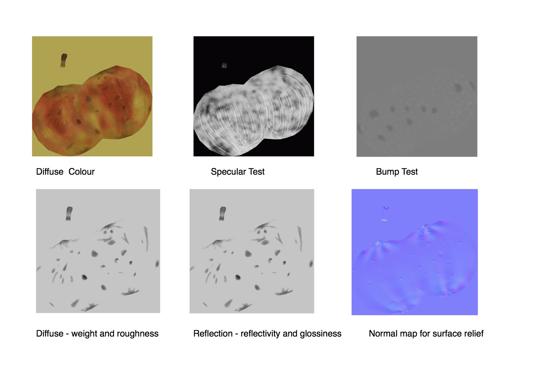
By using one or several of the layers created in mudbox to make these black and white images I’m able to adjust the attributes in the apple’s Mental Ray’s shader. Adjusting the values of the file in colour balance of the shading network translates into how the surface qualities for reflection’s reflectivity and glossiness appear in the final render of the surface.


Sculpt layers can be set with different subdivisional levels for the numbers of mesh polygons. This allows more or less detail in the surface sculpting on that level for that layer. The idea being to vary the surface relief of the apple making the shape for where there is variation and damage to the surface. These different levels of detail can then be used to create different surface details and maps for the final render of the object.
To show these surface relief changes for the apple I sculpted the surface creating a normal map, the bluish coloured one above, to assign to the Maya shaders bump attribute to create the illusion for the changes in surface shapes. I was not doing all the sculpting on the appropieate subdivisional levels, creating differences in the sculpting of the surface is specific to that layers number of polygons, I was sculpting on the base layer as well. Mudbox needs the difference in the surface shape to create the normal map and this reduced the amount of surface changes created by the normal map and changed how the surface looked in my render. It was possible to adjust the normal map in photoshop by duplicating and adjusting the layers using overlay.

-
- diffuse layers in mudbox
-

- sculpt layers in mudbox

When building the shading network a luminosity node is being used instead of ticking the Alpha is Luminance under colour balance. The luminance node converts the three channels of RGB to one alpha channel enamelling the values to be adjusted via the the colour balance’s Colour Gain.

finding the balance between reflectivity and glossiness

getting closer for the balance between reflectivity and glossiness

transferring the values from the reflectivity and glossiness to the colour balance’s colour gain
I could not work out why I was getting a sharp line across the apple between the reflectivity and glossiness with two distinct areas and not being able to adjust them cleanly. I was working out the values in reflectivity and glossiness with the diffuse value included. Turing off the diffuse, putting the colour to black and then adjusting the values between reflectivity and glossiness independently made it clearer to see what was happening. Finding these values and then put them into the colour gain I had more control.

After more adjustments for the reflection for the apple shader and putting the values into the colour gain of the colour balance on the file node it was still not looking the same. After trouble shooting by my lecturer it turned out I did not have a value of 1 for the whites in the images being used to control these attributes, this resulted in the wrong values controlling these attributes. The white in mudbox is one, I need to make sure that is what I select.
Another issue I had overlooked was the glossy samples which was causing the graininess of the render – the number of samples (rays) for glossy reflections. Higher values create a smoother result and is less grainy.

I think I also painted on the wrong subdivisional layer.
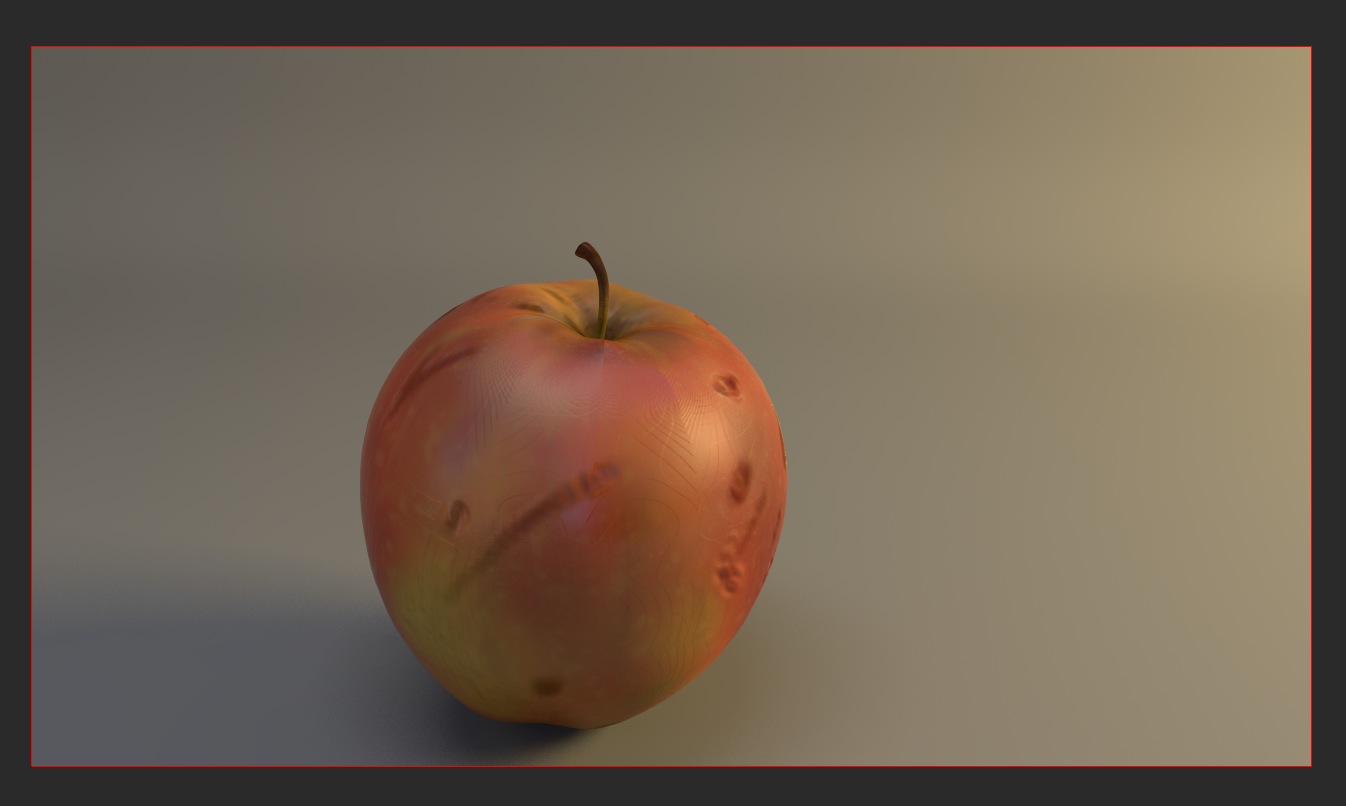
final red apple
BANANA
For the banana I use stencils to create the surface colour and textures. The stencils project the image onto the model’s surface, including the colour .

reference

mud box stencils

When using the projection option under the paint setting in mudbox for these stencils it was important to set the colour in the properties to white. Colour is a multiplier and when white was not selected I was not painting the colour selected in the stencil.
Again using layers to separate the areas of the banana, the base colour being flooded on the model and the darker layers painted in the areas where textures will be created. These different layers for the damage and end parts gave options when selecting different layer combinations for the black and white images. This maps being used for the shader’s smoothness, roughness, mate and reflective surfaces of the banana.

combined layers

black and white layer to use for the diffuse and reflection values where there is damage and darker areas

black and white layer to use for the diffuse and reflection values for the ends
This is an example of using painted layers from mudbox to create and control the realistic properties of the banana. The white areas will have a value of one and the black areas will have a value of zero when used to adjust the surface qualities. The roughness attribute of the banana is totally powdery and chalk at a value of one or white and complexity smooth when at a value of zero or black.
Looking at this black and white image what will happen is that in the white areas it will be totally smooth and the black areas will be chalky. When adjusting the value between zero and one the range from smooth to chalky can be controlled. This means where the banana is damaged the black area will appear rougher and the white area will appear smoother, so the slide set to black will show a totally smooth surface.

I have also used these black and white values to control the banana’s surface qualities of reflection and glossiness as the same areas share these qualities. Because the black and white map is connected to each of these attributes I am able to vary the values for roughness, reflection and shininess separately.

building shading network and values

final banana
PEAR
The adventure of texturing a pear.

Developing from the apple and banana I am looking at the pear differently, thinking about how to approach this while considering the surface qualities of smooth, rough, diffuse and reflectivity. How painting these layers will be used for the pear’s surface qualities.
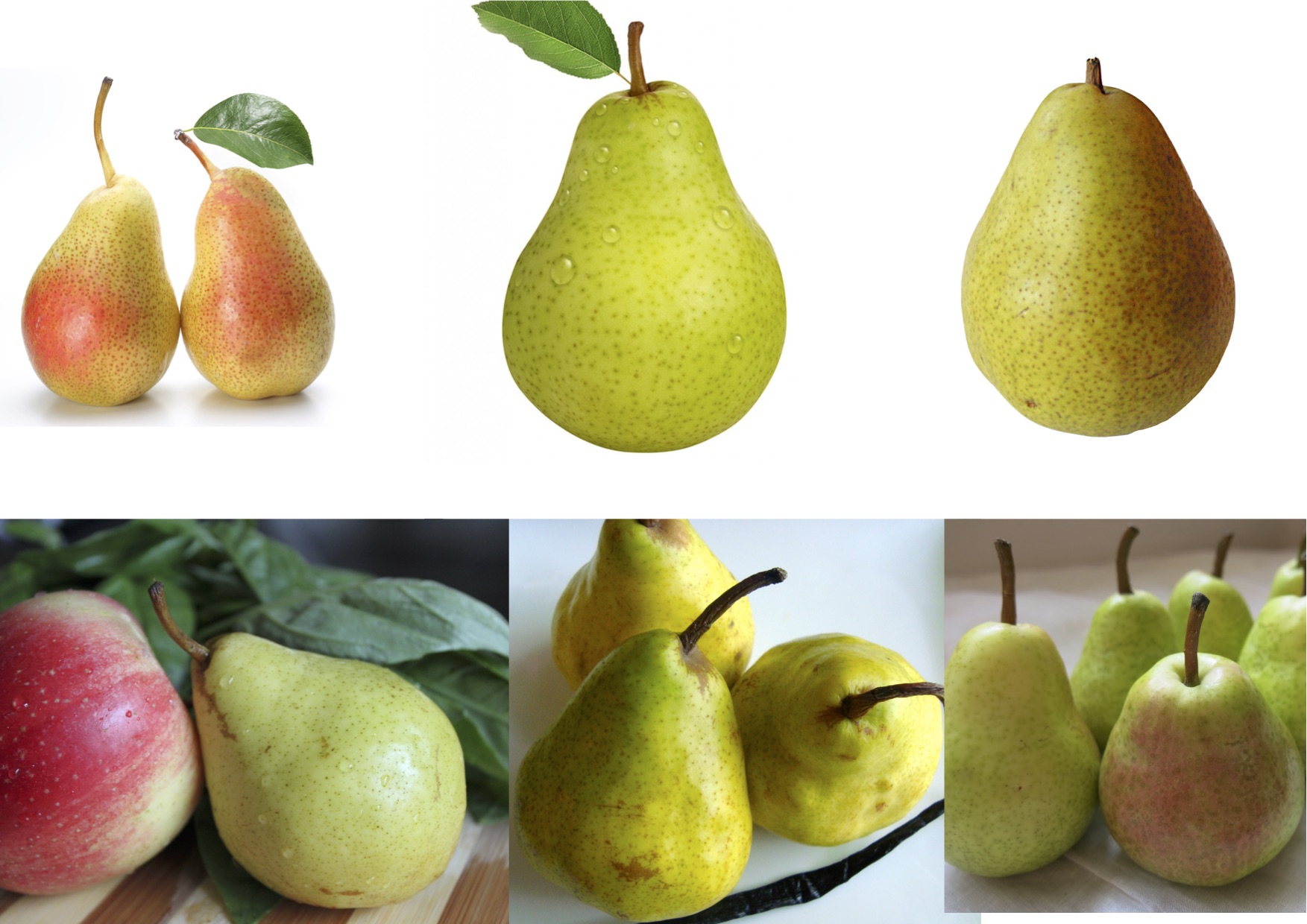
reference
I created a variety of colours, shapes and types of dots for the pear on different layers using both custom made and stock stamps, combining this with projections.
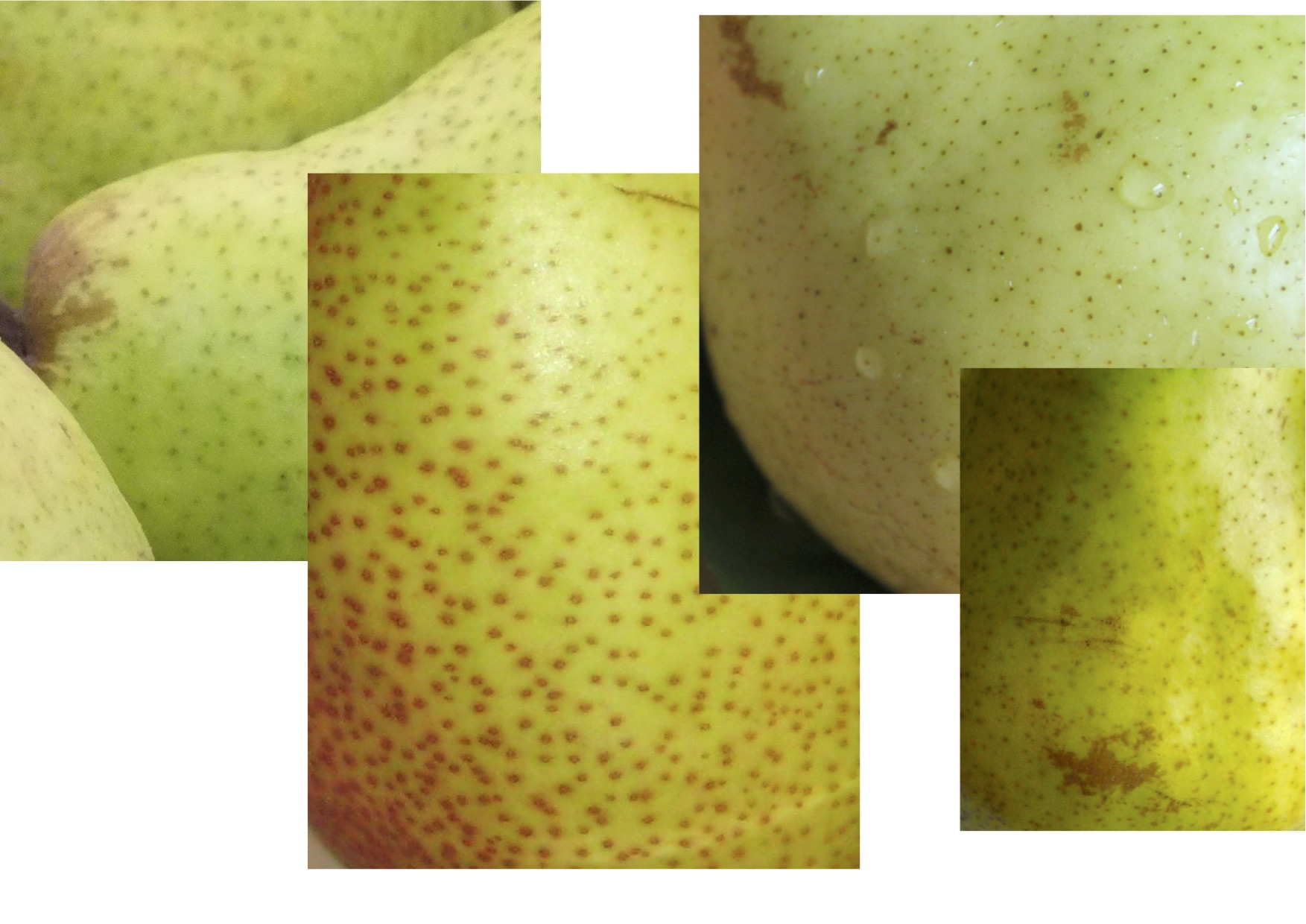
mud box stencils
Again starting with layers, building and blocking out different areas of green and yellow that made up the main colours.
Another layer for the brownish stripe down the side and how it looks with the main colour.
The dotted marks on the pear were painted on the next layer, followed by a layer for the marks, damage and colour around the end area while thinking about how they are rougher than the rest of the surface, the dullness and the variations on the shape of the surface
The next layer was for the stalk area.


Looking at the pear’s surface changes and the painted layers I was able to sculpt the surface variations and damage to go with the colour changes.
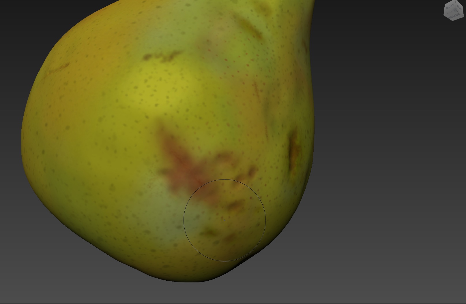

With these two images I started colouring for the marks and sculpting for the surface changes and damaged areas.

I sculptured finer line details at the top and on the stalk, not sure how this will show in the reflectivity and highlights. Thinking back on the tree stump we did in class it is probably where I could have used the ideas of a dirt map and ambient occlusion.

colour layers for the dots and damage duplicated and converted to black and white
Working with the layers to make the black and white files to use in the maya shader for adjusting the defuse and reflective attribute qualities.
Then being able to adjust the differences between smooth, rough, reflective and dull surface values.

colour
In the maya surface shader the are:
Diffuse
– the colour of the object
– the weight, maximum amount of diffuse reflection scattered by the type of surface with zero being black and totally absorbing and one being white and totally reflecting the colour
– roughness which has black at zero and being smooth and one being white and the highest value for powdery or chalkie.
Reflection
– reflectivity with zero or black having no reflection and one being white and highly reflective
– glossiness with zero or black having a totally diffuse reflection and one being white and being a mirror reflection
It is how the paint information is used in these map through the object’s shaders attributes that creates the surface textures. The values between 0 and 1 give the options to choose a texture quality between those values creating a range of surface values. The idea being to use these textures to control the output of the shaders, with some characteristics requiring the use of several textures by combining these attributes.

normal map
The normal map shows the surface sculpt changes from the mudbox sculpt layers.

final pear
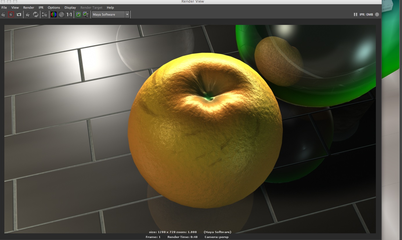
ORANGE

reference
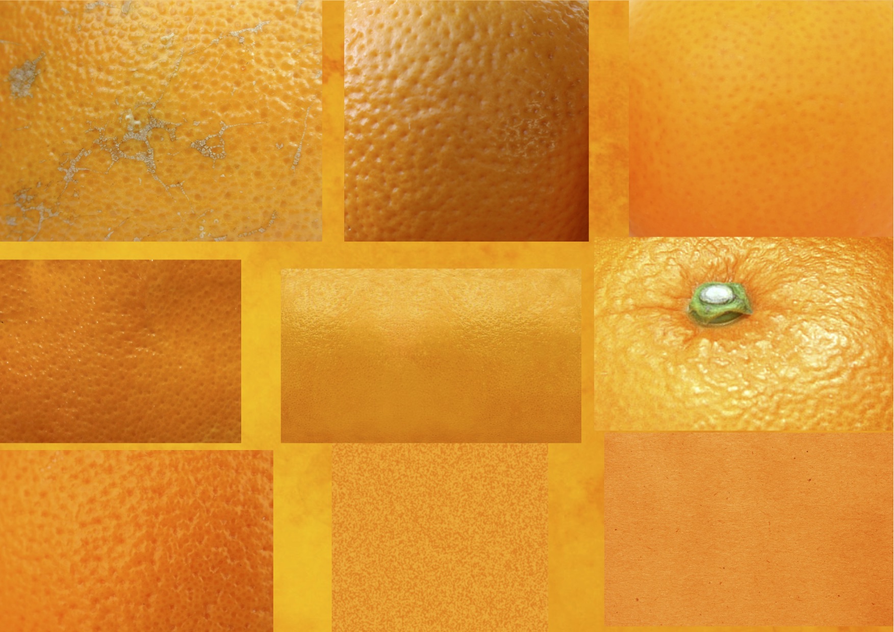
mud box stencils
The image below shows the painted area of the orange as used for the colour attribute in the maya shader. The file is made by using the surface UV’s from a UV layout of the 3D surface. The map is a flattened 2D map of the model’s surface matching the same UV coordinates of the 3D orange where the colour has been painted.

How do I go about the surface relief for the orange? I wanted to see how using stencils to create a bump would work.
On the first attempt I had not realised how the stencil values would work with the black and white colour adjust when converted to black and white. There were more raised areas from the white than indentations from the black for the orange pores. After painting more versions with the stencils and with various sizes, shapes and colours it was improving, less white areas for the pores and more control over how the pores would be on the surface.

adjusting bump value
I had sculpted a few damaged line areas on the surface to include in the extracted normal map, how was this going to work with the bump? Thanks Eric for explaining how to do this. I converted the bump to a normal map, set to overlay with it on top of the normal map I had extracted then was able to output the file into my Maya projects source images folder to be used on the oranges shader.
Normal maps create relief detail on the surface by changing the angle of the surface normals to reflect the light in different ways.

normal map that started out as a painted stencil that was made into a bump map

tangent space normals not selected

tangent space normals selected

final orange
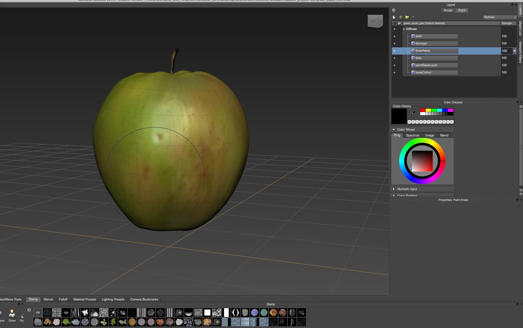
GREEN APPLE
For the green apple’s painting and sculpting I used a mix of the stencils I created in photoshop for the dots and lines with stencil images.


My green apple had a very strong and blown out difference between the reflection and glossiness attributes of the shader which I was not able to control. I could work out how to solve the problem. It turned out to be the lights, too bright and realising they cannot be excluded from the equation. They were too large and too bright and after adjusting the lights I had more control over the shaders reflectivity and glossy values.


UV layout in photoshop
A problem I had was with the painting of the black areas for the reflection and glossiness. The areas were too large, not matching with the areas on the green apple. It was interfering too much with the overall surface qualities, showing up as large blocks of dull and diffuse surface instead of with the selected damaged areas.
Selecting a new layer, flooding with white and using the multiply blend option leaves the layers underneath coming through. I could then see the area in these layers where I wanted to paint the black.
first reflective and glossy map

second reflective and glossy map

stronger, sharper highlight

flatter highlight

a more diffuse highlight
brighter highlight

looking at the reflectivity and specular highlights
shinier highlights

duller highlights
I’m not sure about the level of sculpt detail required and the depth of the changes on the sculpt surface to display the changes via the normal map on the green apples surface.

some apple sculpt detail
A way around this when the sculpt detail is not enough is to use a multiply node in the shading network and adjust the level of detail there. The out colour of the normal map is connected to the input one of the multiply-divide node and below this are the R, G, B boxes to change the values. This is then connected to the bump in the shading network through a luminance node which converts the RGB to a single value to drive the bump value.
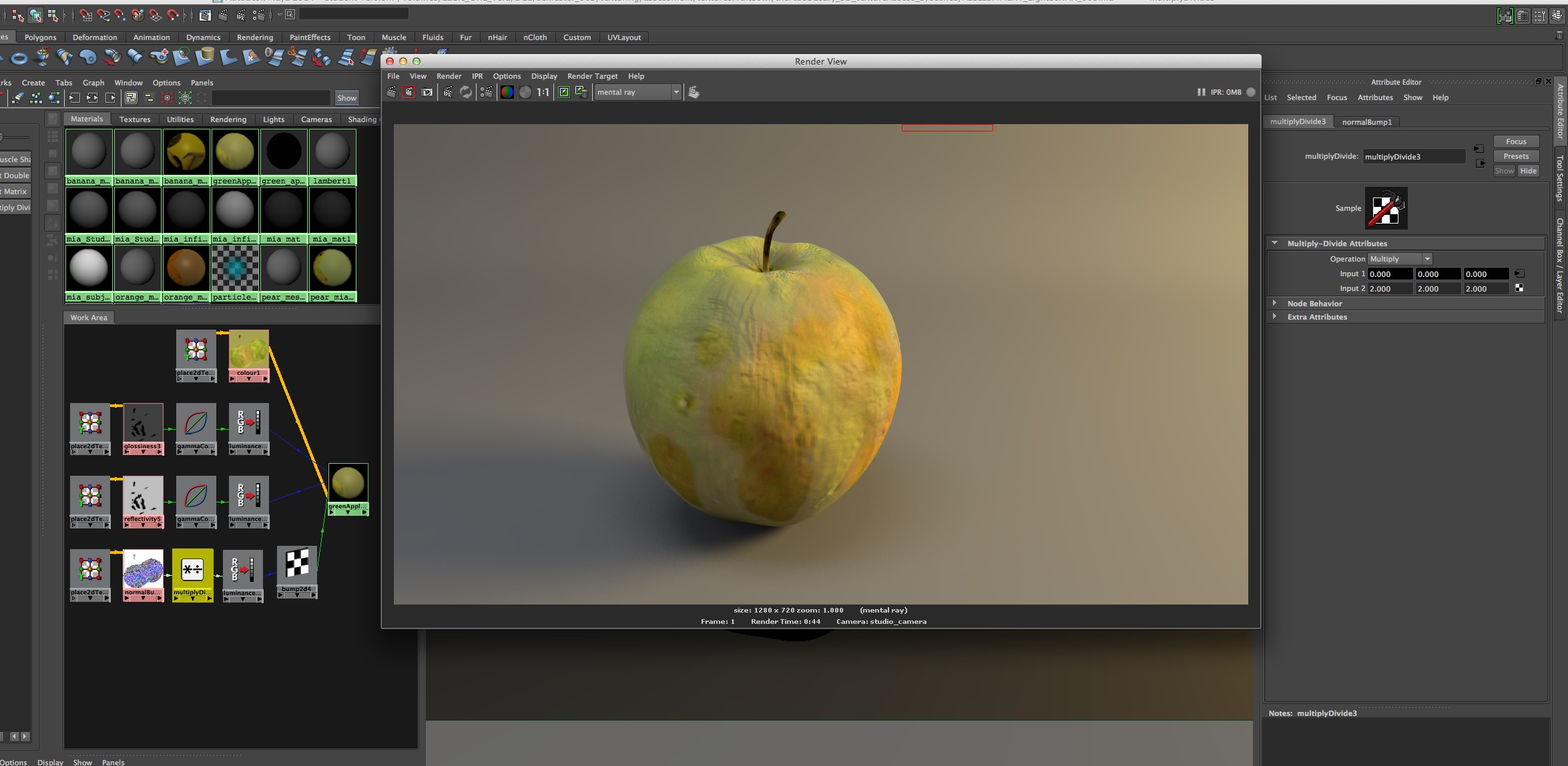
multiply value set to 2.0

multiply value set to 1.1

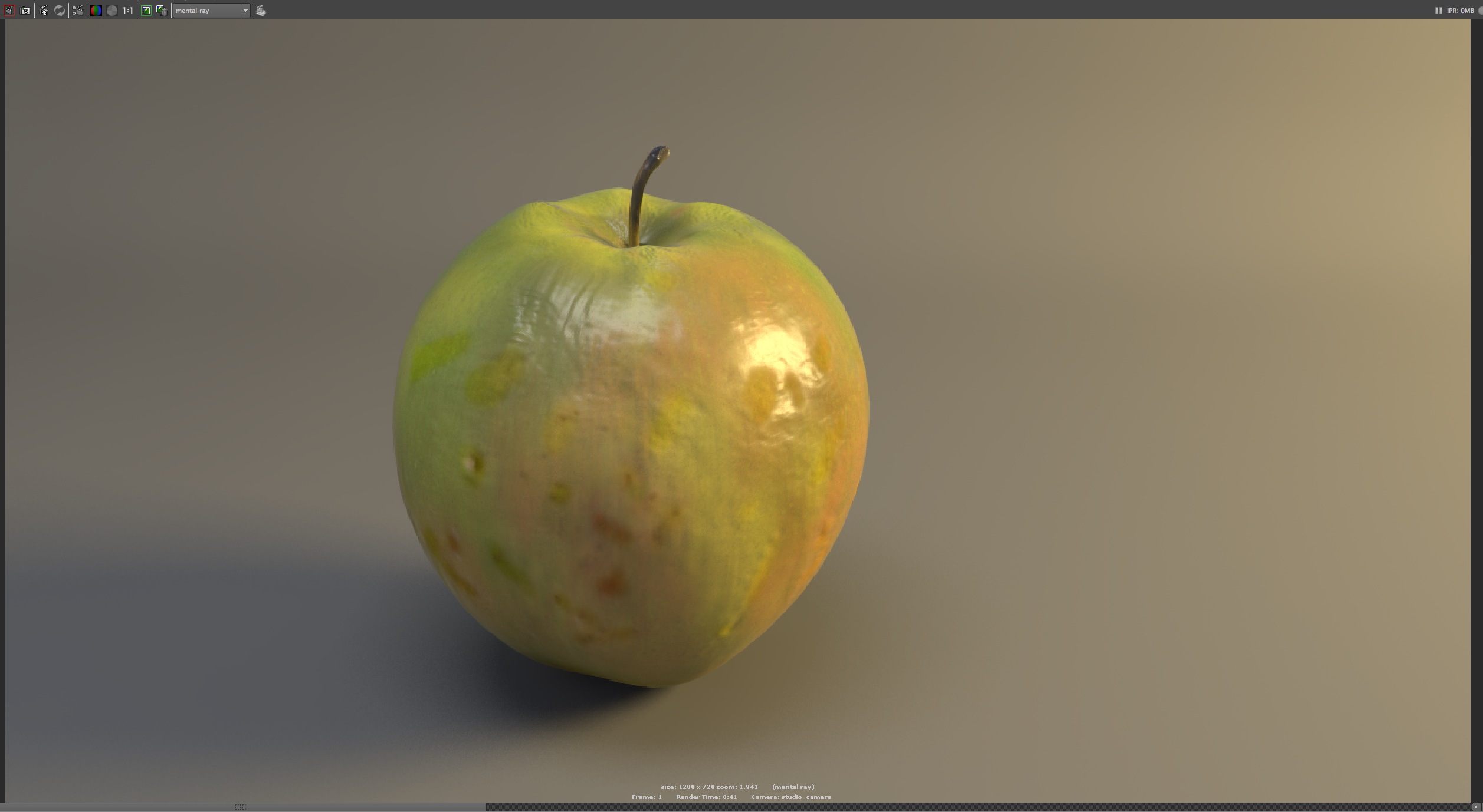
final green apple
I’d like to develop:
– more sculpting details
– painting with the projection of real textures created from the real world environment
– to break down the surface into more layers enabling a great range and flexibility to mix them for different surface textures
– a better understanding of light, dark, black and white in building surface detail when making the texture maps
– to experiment more with the colour adjust, converting to black and white values seeing what a larger range of values does
– to understand more how the mia shader texture network works by compositing the different attributes after working out the values separately
Procedural Network for an Orange
Procedural textures are created through mathematical calculations and have no limitation in size (resolution), derived from mathematical algorithms as opposed to using and pulling vertices. 3D procedurals ignore UVs and have the ability to texture non-uniform geometry.
DIGITAL PROCESSES REPORT
This tutorial is looking at the procedural bump network for an orange using Maya’s hypershade.
To create realistic images shading networks need to consider qualities such as colour, specularity, reflectivity and surface detail. They are the building blocks describing what happens, how objects respond to light, creating the surface appearance and sending this information to the render. The shading networks are build as nodes that define how various colour and texture attributes work together with associated lights and surfaces. The hypershade window lets you connect the nodes attributes and view the connections.

Shader types handle specularity in different ways and needs to be considered for the orange’s surface colour and texture. The phoneE gives control over the specular highlight in regards to the amount of light that is reflected, it has a roughness attribute which can make the material appear rougher and a whiteness control to blend colour highlights between the base colour of the material and the white.
Firstly considering the colour of the surface, mapping a ramp texture shader node into the colour attribute of the phongE creates options for the graduations of colours. The ramp controls the direction on the surface and its interpolation or blending. For the orange giving it a range of colour including the green around the stalk area.

When mapping a noise 2d texture into selected ramp positions the surface can be manipulating by the nodes attributes. This node breaks down the surface into different qualities creating small circular shapes on the orange surface, like dots. The noise shades has attributes such as type, density, spottyness and size rand that are not available in other nodes. Adjusting these values controls the black and white values of the noise. The attached place 2d texture node’s gives control of the position, size and rotation of the UV’s attributes that are created and placed on the surface.
Using the remap colour node, in utilities tab of the hypershader, I’m able to choose colours for the black and white values of the noise shader by converts RGB to HSV giving accurate colour control that relates to the black (zero) and white (one) values set in the noise attributes.
The relief surface detail of the orange can be set up using a fractal texture node. The black and white values are adjusted creating size, shape and depth values for the surface relief. The attached 2d texture node controls the UV space of the geometry, which is inherent in nurbs surfaces. The origin of the surfaces UV coordinate are (0,0) and the surface extends to the left and up where the coordinate is (1,1) on a graph. This is mapped directly on the surface with a join.and the coordinates are used for positioning.

To create the relief appearance the noise texture node is duplicated and mapped into the shader bump attribute. Adjusting the surface normals based on the texture map’s alpha values where white is the height value there is control of the relief detail. The bump maps are grey scale textures and a negative value in the bump notes value creates the illusion of depth.

Creating a stacked bump map allows adding the fractal values to the bump attributes, giving height detail of the orange by adjusting the positive numbers.
Eric I have included this for you,
“ You can also “stack” different bump maps on top of one another. To do this, connect the Out Normal attribute of one bump map to the Normal Camera attribute of another.
Checker Bump3d Cloth Bump3d Blinn
——- —— —– —— —–
Out Alpha –> Bump Value Out Alpha –> Bump Value”
Mapping a second fractal into a third stacked bump and using a colour remap node allows the addition of surface relief and colouring for damage and dirt on the skin.

Considering the shininess of the orange surface adjusting the reflective of the shader under specular shading will reduce how much the surface reflects this light. Setting to zero will not reflect at all. The orange has low reflectivity which could be as low as .05.
Some helpful definitions:
diffuse : white = 1, position of surface and it’s angle relative to the light. How much light is absorbed and how much is scattered in all directions by surface imperfections. Rougher surfaces tend to have higher diffuse values.
specular : calculated from a specific camera angle and is based on the angle between the light, the surface and camera. View-dependent, shading. Give appropriate size. more highlights
References:
Maya online help files
Birn, Jeremy, and Jeremy Birn. Digital Lighting and Rendering. Indianapolis, Ind.; London: New Riders ; Pearson Education [distributor], 2006.
Brown, Tim H, and Alias (Firm). The Art of Maya: An Introduction to 3D Computer Graphics. Toronto: Alias Systems Corp. Education, 2005.
Derakhshani, Dariush J. Introducing Autodesk Maya 2013. 1st ed. Indianapolis, IN: Wiley Pub., Inc, 2012.
UV LAYOUT DIARY
Texture Maps attach themselves to geometry by texture coordinates called UV’s. Need to manually organise UV’s to minimise texture loss and to distribute the texture evenly. Some of the most commonly used menus are Cut UVs, Sew UVs, Move UVs, Relax UVs, Normalize UVs and Unitize UVs. Areas that are not especially important are allotted to a comparatively smaller area of the texture map.
Nurbs come complete with UVs and UV coordinates are always locked, they cannot be adjusted without adjusting the geometry.
Polygons need UV’s assigned to them, it is done by using projections and the UV positions can be edited without affecting the geometry. The projections arranges the pattern of the UVs, it can be distorted, stretched, pinched or overlapping. To get more uniform checkered patterns the UV’s need to be adjusted.
Pelt Mapping unfolds the surface so that it becomes a single large shell with a minimal number of seams.
Ptex, per-face texture mapping, does not require UV mapping and is able to store separate texture maps for each polygon face in a specialised file format.
 UV mapping uses two-dimensional layouts of the 3D surface for applying textures and using the software headus UVLayout the character’s
 surface has become a 2D layout map. The UV map is a guide for the placement of images.
In this exercise I was aiming for minimal stretching, tearing and distortion in the layouts so when surface textures are applied to the model they are as clean as possible. The brief was to do the UV layout from the front camera’s point of view.

Looking at the character from the front the first consideration was where to start making the seams. The obvious ones were between the cloths and the body, then how to break up the cloths considering the shirt and pants for unseen seams and clean painting and texturing. For the top I decided to go along the underarm and across the shoulder and for the pants along the side and across the inside. I did have a look at doing the join down the back of the top and pants, it was more difficult to unfold evenly as a single piece. I found the compromise between this and doing two pieces gave me a more even unfold.

The idea is to move the UV’S in the layout to achieve minimal distortion to the surface of the model. It was not so easy to decide on where to put the seams for the arms, hands, legs and feet. After cutting a few different ways between the arms and the hands and around the finger nails I ended up cutting the hands and arms as two pieces. After flattening both pieces then working out a place to join them to put the seam away from the camera.

There were several overlapping UV, particularly around the finger nails and this was another area where I compromised on getting rid of the overlaps and keeping minimal distortion of the numbers on the 3D model in not so obvious areas.

In the 3D view numbers can be displayed in each square on the surface and they display the size, distortion and blurriness created when working on the 2D texture map. The face was not so easy around the nose and eyebrows to get an even unfold on the model. It was a constant toggle between moving the UV’s on the map and looking at the distortion on the model to find the best possible compromise between the green colour on the map and the undistorted numbers on the model.

For the final layout it is efficient use of the layout’s space to be able to stack the same parts that have been UV mapped, they can be painted together as one piece.


UV TEXTURE MAPPING
“There are two types of textures: procedural and bitmapped. Procedural textures use the Maya nodes attribute to generate an effect, such as ramp, checkerboard or fractal noise textures. You can adjust each of these procedural textures by changing their attribute values. A map, on the other hand, is a saved image file that is imported into the scene through a file texture node.” Introducing Autodesk Maya 2013, page 286.
UV mapping places the texture directly on the surface, giving the point on the surface by using the surfaces 2D coordinating system for width and height. UV’s are not often laid automatically for immediate use, often being bunched up and needing to be adjusted. Seams can be chosen to work the better ways, such as away from the camera’s view and focusing on areas of less detailed texturing. Also needing to eliminating overlapping for a clean layout and choosing the best options for the surface texture layout required.
Maya and other software is able to lay out these 3D UV’s as a flat surface connect the textures to the 3D surface making it possible to choose options for how this would look best. Where do I put the edges, where will they appear on the surface of the model? How do I map out the 3D surface as a 2D map with cutting, unfolding and stitching together the pieces while considering how the texture will look while minimising the visible distortion. The aim being to create a flat piece that will wrap around the shape with as few seams and with as little distortion of UV’s as possible.
The model’s surface shader have attributes that give the surface definition and each attriubte has different effects on how the model looks. Texture maps can be connected to these shader attributes or the whole object.
OTHER OPTIONS FOR TEXTURING
We continued from painting in photoshop to painting the surface mesh of 3D models. Polygons and Nurbs have UV coordinates that are part of the surface mesh enabling the use of a 2D UV maps. These maps can be exported to photoshop and used as references to the surface geometry for the painting of the texture.
We touched on the pipeline connecting these photoshop texture files being saved in Maya’s source images and connected to the shaders attributes via the file nodes.
The files can be made through different software programs, include digital pictures and scanned photos.
Maya also has a built in paint effects tool, a rendering effect using brushes that creates strokes to paint textures on the surface of 3D meshs.
POLYPAINT
Polypaint allows painting on a model’s surface without first assigning a texture map. A texture map can be created at a later time, and the painted surface can be transferred to the map.
Polypainting offers significant advantages compared to standard workflow:
- The resolution of the texture map need not be decided in advance. This is particularly valuable if you find you need more detailing on an area than you thought you would. Instead of repainting a new, larger texture map, you can simply transfer the existing surface painting to a new, larger map, with no rework necessary.
- Similarly, the UV unwrapping need not be fixed in advance. If one unwrapping proves unsatisfactory, simply create a different unwrapping and transfer the surface painting to that map.
- Removing UVs from your model frees up system resources and allows you to work with more polygons.
SOME READING ALONG THE WAY
3D COAT
3DCoat is the one application that has all the tools you need to take your 3D idea from a block of digital clay all the way to a production ready, fully textured organic or hard surface model. Today 3DCoat is available to learn at 240 Universities, colleges and schools worldwide.
UVs
The first interactive 3D graphics systems didn’t have the processing and rendering power to draw directly on the model, so the texture had to be edited in a standard 2D paint program and the 3D program just arranged texture (UV) coordinates.
Traditional UV layout has its purpose, as well as Ptex, UDIM’s for things like 32k texture maps. In Maya, consider copying UVs from skin weights from teh rigged version to the UV’d version.
MUDBOX
Mudbox 2016, importing a retopologised mesh from Maya (using Quad draw over a sculpt), using ‘send to’. Set it up to extract textures. It appeared to work and texture layers were created, but they are blank. The retopologised mesh has good UVs. In the extract texture maps options the source and target models were triple checked. Tangent space. Ray casted instead of subdivision (as the manual retop is more efficient than the base mesh). Work, but only after I added a new material to the target mesh, before extracting the textures from the source mesh. Possibly the mesh imported from Maya would have only had a default material and perhaps Mudbox was not recognising it as a valid material to bake to. It appears that the compatibility between Maya’s exported mesh and Mudbox’s extract texture procedure is somehow broken.
PHOTOSHOP DIARY
What creates the texture, what do we respond too? It is manufactured, soft, flexible, light, strong, regular, uniform, matt, warm colour, slightly rough? What is it? My first experiment was adding an adjustment layer in photoshop to this image of Suzie Idiens work taken at the SNO Gallery which focuses on non-objective art. Making colour corrections to the layer or layers below with hue/saturation and seeing if a different mood or feeling to the surface is created. The original photography is on the left.

Texture is something we see and feel. It can have an emotional relationship and/or response that conveys messages and memories. It is tactile, with an appearance and orientation of a physical composition and structure with colour and intensity. In painting and 3D it can be real or an illusion, creating the surface of a visible object with those surface characteristics and appearance. These can include aspects of its physical composition and structure including size, shape, density, arrangement and proportion. Textures are a variety of rough and smooth and can be described in many ways such as is it living or manufactured, is it hard, soft, light, heavy, fragile, strong, rigid, flexible, is it smooth, shiny, matt, reflective, dull, rough, sharp, dimpled, cracked, chalky, flaky, what is the colour or pattern. Starting with photoshop brushes we experimented with how they are able to create various size lines, textures and shapes with options for colour, flow (how quickly the paint is applied), tip pressure and opacity variations. With the brush tool there are an amazing range of options available for each brush choice. This can be the diameter, spacing, scatter, tilt, angle, roundness, direction of the stroke, the number and position of the brush stroke marks, texture, dual brushes using two tips, using adjustments with foreground and background colours. If this is not enough noise (random pixels), wet edges (like watercolour), airbursh (soft airbrush look), smoothing (smooths arcs) are brush tip characteristics that can be adjusted.
 Making our own brushes from captured shapes of textured rubbings and scanned images opened up a whole new range of options. This included rubbings we did of the floor, ground, walls, plants, leaves, bark, furniture and objects. I created this sample of brush shapes from one of the rubbings and made adjustments with shape dynamics, texture, scattering and lots of other sliders, not so technical and lots of fun.
 To make our custom brush we made a selection from the scanned files, went into Edit > define brush preset and named the new brush, it is saved at the bottom of the stack in the brushes preset window, no 795. To manage the brush, such as saving the setting as a new brush select New Brush Preset from the brushes preset window drop down options. The brushes can also be saved by selecting the Preset Manager in the same drop down menu with options to Load, Save Set, Rename or Delete, there is also a reset option to reset the defaults in the same drop down menu or select particular groups.

The same as for the brush, we created patterns from the textured rubbings. By selecting an area of the pattern, saving it – edit > define pattern a pattern can be created for use when painting surfaces in photoshop, the selection cannot be feathered. The pattern can be used for Pattern Stamp tool or as a basis for the Healing Brush (which blends), Paint Bucket and Patch tools. The patterns are selected from the option bar and manage using the Preset Manager. Options can also be accessed via Edit > Fill, choose pattern and options from the pop-up menu. There are also other fill options such as Mode, Opacity or Preserve Transparency and it is probably better to do this from the Layers panel giving more flexibility later. The seam lines can be offset with Filter > Other > Offset and offset the edges of the frame in the image area, remembering not to lose the essence of the texture.
I can select my pattern in the texture options of the brush and use this to create brush tip textures with adjustments for the scale and depth. The scattering option varies the values in scatter, count and jitter with the other options available as for all brush tip shapes. As well as starting to collect textures for a brush and pattern library with these rubbings I was thinking about how they could be applied to surfaces.
MID TONE BUILD
Painting timber and wood textures using the mid tone build technique and using new brush shapes.

Selected Queensland Maple, being a Queenslander, I started with a flat mid-tone colour flooding the surface with the colour. Creating a new layer using the new brush shapes we had created and bigger brush sizes I started to build the colour with darker tones. Also varying the brush, its size and adjusting the mid roundness of shape dynamics to help take away the straight edge. Then doing the same for the lighter layer and varying the colour, pressure, opacity and flow bringing in more of the lighter and darker detail. To create the textures I used smaller brushes on a new layer, painting in the very dark and light fine details. I was then able to select and distort the marks with the transform option, adjusting the position and shape over the surface. With only part of the surface covered I then duplicated, repeating and repositioning the layer on a new layer to cover the area. To lighten and vary the colour of the marks I used a low opacity and the eraser tool adding to the surface texture.
SOFT TO SHARP (Pull Focus)
This weeks exercise was painting smooth and rough stone, learning about pull focus in our work as we built up the layers from soft to sharp.

polished rock
For the smooth stone we started with wet general colours, a mid tone, using big soft brushes building soft pale colours using around 30% opacity and maybe flow around 75%. Putting down random shapes suggesting the colour and building the out of focus base. Increasing the opacity and decreasing the size of the brush in the next layer to sharpen the image. Varying the thick and thin lines and starting to include some texture , while adding lighter and darker tones to build the mid layer. To develop the point of focus I continuing to work with brush sizes and settings while varying the brush’s opacity and flow to increasing the light and dark fine details showing deeper textures. Continuing with the detail in Shape Dynamics adjusting the Minimum Diameter, Angle Jitter, Roundness Jitter and Minimum Roundness I was able to get closer to a brush stroke that gave the highlighted colour edges and texture to the image. At the end I used the erasor, adjusting the opacity and varying the size to soften the colours and add depth to the textures, giving another quality into the surface.
rough rock
The rough stone was built in a similar way to the smooth stone using different strokes and blocks of colour. Again starting with a general base layer of broad colour then working in a more detailed middle layers, adding variation while keeping the stokes soft and adding a little texture without saturating the colours. Starting to include the outline of some of the rough surface shapes with more variations of colour, brush size and the brushes options to introducing more variety than in the mid tone layer. I think there was possibly not enough areas of contrast with the solid colour in the mid tone layers to creating the detailed surface, like cracks and edges and to building up the focus areas. I used scattering more and started to develop areas leading to finer details, looking more at the textures the brushes were creating. I needed to look more at the areas of stronger contrasts, the opacity and the direction of the light with lighter and darker toned areas of the stone that were catching the light and shadows.
BLEND MODES
-

- Normal Blend Mode
-

- Multiply Blend Mode Layer
-

- Overlay Blend Mode
-

- Screen Blend Mode
-
- Overlay Blend Mode Colour Bottom Layer


-
- Screen Layer Mode
-

- Multiply Layer Mode
Blend modes are how the colour pixels on one layer blend, combine or interacts with pixels in the layer or layers underneath or sometimes above. They are grouped in categories with the general blend modes of darken, lighten, lighting or contrast, invert or comparative and HSL or composite colour. The layer opacity value can also be adjusted in the layers panel, allowing the mixing of the active layer with the layers below in varying percentages with 100% being completely opaque and 0% being completely transparent. Above are some learning experiments I did with colour, black and white for different mode options.
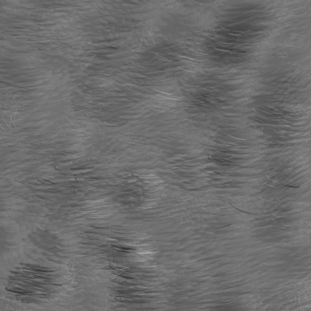
PAINTING REALISTIC FUR
The underpainting textured layer of the fur was done with more of a blunt, stiff brush as opposed to the softer brushes used for the base layer of the timber and stone surfaces. Building the mid layers with a dual brush, the contrasting lines for the fur helped define the surface texture. By adjusting the brush tip and using variations of black and white values with the foreground and background colours in Colour Dynamics it started giving the illusion of depth. Adjusting the opacity, flow direction, size, shape dynamics and angle jitter direction for a row of hairs and having the brush stroke follow the direction of the fur suggested shadows and deeper textures.
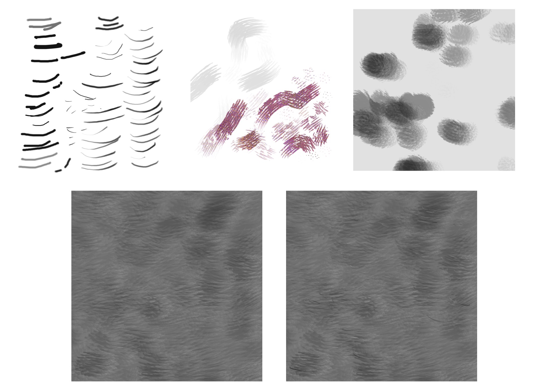
To make singe hair strokes on the finer detailed layer I worked with brush no 60. Adjusting the size and angle to improve the stroke edges and spacing to give a continuous line. In Shape Dynamics adjusting the minimum diameter worked to have the ends of the stroke pointing, not a blunt square and I left the angle and roundness jitter alone as this took away from the straight edge. Now I am able to continuing building depth and focus with the single stroke, varying the colour , having control of the brush direction and pen pressure to help with the stroke. For the detailed layer there was more focus on the random hair detail, to look more natural as nothing in nature is repetitive.
PAINTING REALISTIC SKIN

For the skin we continued as we have been doing by starting with a base tissue colour layer or fill layer. This is a solid colour and the next layer builds the varying colours by picking different values and tones to create the random contrasting colours. Lowering the opacity and pressure on both the brush and eraser tool to varied and soften the surface. On the third layer the stronger variations of light and dark on smaller areas were done to be able to use bevel and emboss and give the visual impact of depth and height to the surface. Layer > Layer Style > Bevel and Emboss. This gives options for soft or hard edges, how raised or sunken the edge of the bevel or pattern appears, the direction for adjusting the position of the highlight either along the light source or the shadow near the light source, size and soften for bluring the shading of the effect and contours can be adjusted and textures added. Expanding on this we painted the veins in a couple of colours with different brush sizes and applied the bevel and emboss to show the veins on the skin.

The next layer introduces a lighter colour using a screen mode, lowering the opacity and taking into consideration the race and skin colour. When this is applied to the layer it lightens the image by multiplying the inverse of the blend and base colours, screening with black leaves the colour unchanged and with white produces white, the opposite to multiply. It also reduces the contrast of the overall colour tending to flatten the image. Using the spattery brush with emboss selected and depth down, skin pores are created on a new, more detailed layer. This layer can be duplicated to create sun damage with softer and darker areas and then adding freckles for more detail. 
 I am yet to work on Barry Deans secret of painting skin with a number of thin, transparent layers to created the subtle variation of surface texture and to see how this looks giving the skin the translucent and alive look he refers to in his notes.
STILL LIFE STUDY – APPLE
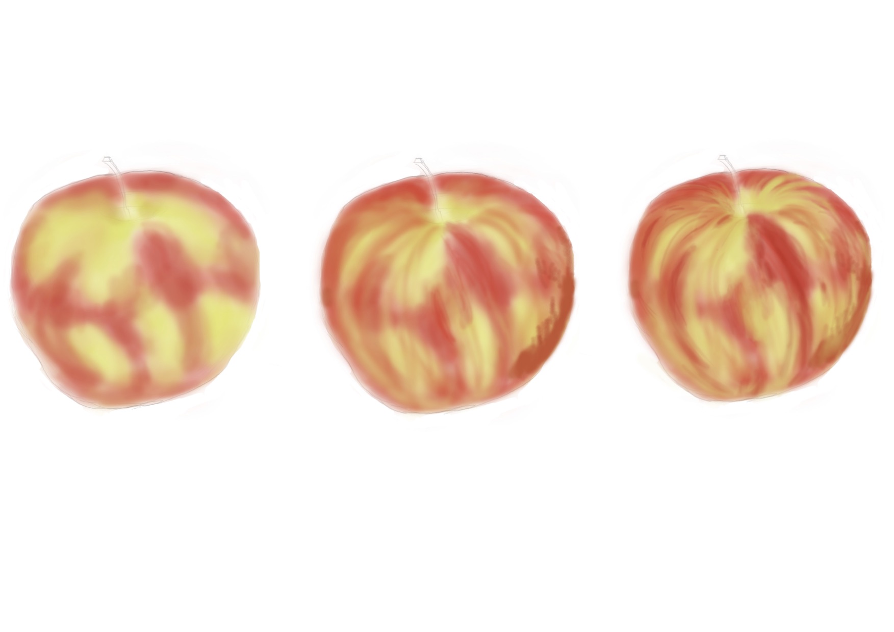
I starting with the sketch layer while thinking about the apple’s placement with reference to the objects point of view, the setting, any interesting points of reference and the lighting. Applying the layered working structure we covered over the last few weeks there are the sketch, under paint, mid-pass, refine, detail, highlight and shadow layers to create the apple and surface texture. For the underpainting we chose two or three colours from the colours on the apple surface, the brushes do not matter much and slosh down the colour breaking up the surface with solid colour. The mid-pass breaks up the surface a bit more, bridging colours and starts to work the contour of the surface, called cross contouring. Follow the direction of the form from the stalk to where it disappears at the bottom and using slightly lower opacity and soft edges on the brush to continue building up the apple’s texture. The colour is also stronger in the middle with softer edges, blend by picking soft colours with bridging colours, a couple of variations of yellow and red with some apple green mixed in. Moving to a smaller brush, modifying it by adjusting bristles, thickness, softness and stiffness to start building more detail.  To add strokes to the surface we used the brush a bit like a rake, keeping the pen vertical and varying the opacity and pressure. Then working with a finer brush to build and refined the detail, using colours and shapes while looking carefully at the surface to see what it looks like. Now I am starting to put in the shapes that I see on the apple, becoming more random and spending more time on these layers. Keep looking carefully at the highlights and break the shape up a bit, thing about the shadow areas, the stalk, imperfections, spots and shadows with grey to give volume and bring the opacity back up.
  Select the white background and paint in with graduation and shadow under the apple. For the grey background put the layer mode to multiply and opacity to 50%. To clean up the edges, shift select all the layers while hiding the layers that are not wanted. Select the top empty new layer, above what is to be cleaned and flatten and apply what is visible – Image > Apply Image. Thanks Barry for opening another door, now I am looking forward to learning more about photoshop and including it in as part of my knowledge.
RESEARCH
“Architectural Material,” n.d. http://docs.autodesk.com/MENTALRAY/2014/ENU/mental-ray-help/files/shaders/architectural/arch_mtl.html#mi_shader__mia_material_x.
Autodesk Maya Techniques: Hyper-realistic Creature Creation. San Rafael, Calif.: Autodesk, Inc, 2007.
Birn, Jeremy, and Jeremy Birn. Digital Lighting and Rendering. Indianapolis, Ind.; London: New Riders ; Pearson Education [distributor], 2006.
Brown, Blain. Motion Picture and Video Lighting. 2nd ed., New ed. Amsterdam ; Boston: Elsevier/Focal Press, 2008.
“Common Techniques to Improve Shadow Depth Maps,” n.d. http://msdn.microsoft.com/en-us/library/windows/desktop/ee416324(v=vs.85).aspx.
Demers, Owen. Digital Texturing & Painting. Indianapolis, IN: New Riders, 2002.
Derakhshani, Dariush J. Introducing Autodesk Maya 2013. 1st ed. Indianapolis, IN: Wiley Pub., Inc, 2012.
Gyncild, Brie. Adobe Photoshop CS6: Classroom in a Book. Classroom in a Book. Berkeley, Calif: Adobe Press/Peachpit, 2012.
Kermanikian, Ara. Introducing Mudbox. Sybex Serious Skills. Indianapolis, Ind: Wiley, 2010.
“Mudbox Online Help Files,” n.d. http://docs.autodesk.com/MUD/2015/ENU//index.html#!/url=./files/GUID-0DF909C0-A02A-4729-A285-F7E5F40BD71A.htm.
Obermeier, Barbara. Photoshop CS5 All-in-one for Dummies. For Dummies. Hoboken, N.J: Wiley Publishing, 2010.
Palamar, Todd. Mastering Autodesk Maya 2014: Autodesk Official Press. 1st ed. Indianapolis, IN: John Wiley & Sons, 2013.
Präkel, David. Lighting: N. Light of a Particular Quality or the Equipment That Produces It. Lausanne; London; New York: AVA Academia, 2007.
“UV Layout User Guide 2014,” n.d. http://www.uvlayout.com/doc/User_Guide:_About_UVLayout.
“UVLayout,” n.d. https://www.uvlayout.com/index.php?option=com_wrapper&Itemid=67.
<www.sophia.org/tutorials/elements-of-art-texture> http://msdn.microsoft.com/en-us/library/bb976075(v=snagamestudio.31).aspx NVIDI Corporation, Mental Ray Architectural and Design Visualization Shader Library, 1986, 2011
Elliminate Texture Confusion: Bump, Normal and Displacement Maps
THE BEGINNING of EXPLORING PROCEDURAL PROCESSES
 – ramp and ramp shader I discovered are not the same thing
– with the colour shader selected in AE, clicking the map button the book asked that the Normal is checked – where and what is that?
– still getting my heard around projects, scenes, new and set when setting up and working in  scenes and projects
– 3 hours to do the wheels on the wagon from the book, the hypergraph and AE, it is becoming more familiar in my brain
 – doing the wagon strips with the UV texture editor and photoshop is a totally new experience, going slowly and taking time over a couple of days to read through it
– do not understand how the selected to laid out in the UVTE. I was not able to work out the stripes and logo for the side of the wagon
– Photoshop, now to remember and learn more, do not understand what setting to use
Texturing, from the book using a photo converted to iff in photoshop and creating a photoshop file from texturing>create psd network.
The first box is a polygon, second is a nurb, third is using projection, next one I was attempting to access the Place2dTesture node and did not work it out and the last one is the photoshop file form create psd network and did not work out about the transparency or bump nodes.
Texturing with layered shaders, from the book – 2 hours
 I was introduced to the ‘Fit to bBox’ and placement nodes for the wooden handle, then the layered shader for the metal spike. I’m still working out what nodes do what, how and why they are ordered as they are, how I access and order them in the hypershade and the basics of what they do in the attribute editor. Not clear on the order and process of the layered shader. Could not work out the baking a texture, kept coming up with ‘wood2 is connected to more than one shading group’.
HYPERSHADE and LIGHTS
Questions – straight edge on ramp when interpolation is none, when creating a hole and joining the edges does this impact on the ramp lines for colour
– can there be a u and v ramp on the same object
scene has 3 default shaders loaded, textures and shaders to give objects their visual appearance, shader networks are made  up of render nodes, node attributes in the AE, shaders dealing with specular and diffused
  parameters together with lighting
– lambert evenly diffuses and scatters light evenly for dull or matte surfaces eg paper
– phong specular highlights and reflectivity creating sharp hot spots that drop off sharply eg plastics, glass, most metals
– blinn accurate specular lighting that reflects light and diffuses more gradually than a phong eg shiny and metallic surfaces
 – phong E more control over the specular highlight to adjust the glossiness of the surface. The specular drops off more gradually and yet remains sharper than a -Blinn giving more options for metallic reflections
– anisotropic reflects lift unevenly creating irregular-shaped specular highlights deformed surfaces eg foil or plastic wrap, directional grooves
– layered stacking of complex effects, use transparency maps to define areas eg labels, dirt to aged surfaces
– ramp smooth transitions between colours and to control paths with ramp texture nodes attached to the attributes colour, transparency, incandescence, special curve ramp
– lights, the light coming from the lamp was a challenge, not sure about the white on the wheels and the highlights and shadows could be more subtle.
Texturing for 3D Short Answer Exam
Question 1: Colour
Explain the following words in terms of how they define colour:
Hue (2 marks) or pure colour, what we commonly refer to as colour, the names we are familiar with and the characteristic that distinguishes one colour from another, red from yellow. The colours on the colour wheel are three primary, three secondary and six tertiary. These colours are additive, created by light, pure RGB = white light. There are subtractive colours made by pigments which are RYB. The reflected light from a surface creates colour with all colours being absorbed you get black.
Saturation (2 marks) Also known as intensity, saturation describes the strength or purity of a colour. The ratio of a colour to white is a measure of the colourʼs purity with pure colour being fully saturated. Colour can be taken out leaving a black and white version of an image.
Value (2 marks) or brightness of a colour, how light or dark it is from black to white, adds values for depth relative to lightness and darkness. Light colours are high value and dark colours are low value and can lead to complete black or white based on the amount of light emanating from the colour. It can separate object in space.
HSV: Value 0 to 1 in the HSV slider goes from black (0) to white (1) When the value is black there is no colour even when changing saturation and/or colour. When it is white colour can be added with saturation from white to pure colour.
Question 2: Colour
Colour – Discuss colour temperature, by giving a brief description of what is meant by ʻcoolʼ or ʻwarmʼ colours.
Colour temperatures are measured in degrees Kelvin, the unit of absolute temperature which originated from the heat glow when a block of carbon was heated and this is refereed to as colour temperature. With black absorbing all the wavelengths, it produced a range of different colours at different temperatures and is describing the colour characteristics of the light. The Kelvin scale starts at ʻabsolute zeroʼ.
Kelvin scale can range from the flame of a candle at around 1800K and the deep blue sky at around 10,000K with average noon daylight being 5000K or white light.
The colours start to become bluer at higher temperatures, over 5,000K and the cool colours are the lower temperatures increase the orange and reds.
We interpret colours using them to describe our world with emotion, feelings and our senses.
The cool colours of green, blue and purple recede, often being used for shadows and helps to place and anchor objects in the environment. They are also the colours we associate with night, water, nature, calming and relaxing. The warm colours, reds, yellows and oranges advance in our perception. Warm colours can be cooled down by adding blue or made warmer by adding yellow.
Question 3: Photoshop
Describe how to create an original brush in Photoshop and how to save and manage that brush.
An original brush can be created from a selection of images such as photographs, art work and texture rubbings that can be scanned, created or imported to create the brush. The image can be colour though when saving the selection in photoshop as a brush photoshop converts it to grey scale. The white pixels become transparent, 0% opacity and the black pixels become opaque, 100% opacity. The image can be adjusted or cleaned before saving using a selection of options with adjustments under the image menu. This include options such as levels, curves, exposure, shadows/highlights and brightness/contrast.
One way to make the brush is by making a selection using one of the selection tools from the tools panel. With the right amount of contrast make the brush, edit > define brush preset and a box appears, name the brush and the selection is saved in the brushes preset palette at the end of the list.
Brushes are saved using the preset manager, under the edit menu, which is used to load, rename, delete, organise, and save custom content and presets for brushes, swatches, gradients, styles, patterns, contours, custom shapes and tool settings. Select the brushes, go to the preset manager and save (set) brushes, choose the location to save the brushes and they will be save as an .abr file. They can be saved in libraries then reloaded through the preset manager for later use.
To modify brushes use the brush presets under the brushes tab where there is access to the options for altering the appearance of brush strokes. There are adjustments for options such as spacing which can create dots, a dotted line or several strokes rather than the seamless line. Shape Dynamics can control the size, angle and roundness of the tip. The bottom panel displays a preview of what the brush stroke currently looks like.
Question 4: Photoshop
Name two layer blending modes and describe their blending effect.
Blend modes are how the colour pixels on one layer blend, combine or interacts with pixels in the layer or layers underneath. They are grouped in categories with the general blend modes of darken, lighten, lighting or contrast, invert or comparative and HSL or composite colour. The layer opacity value can also be adjusted in the layers panel, allowing the mixing of the active layer with the layers below in varying percentages with 100% being completely opaque and 0% being completely transparent.
The multiply shading mode when applied to a layer the areas of pure white disappear from view, everything else becomes darker and areas of pure black remain black as you cannot make it any darker than it is. The colour of the blend layer blends with the layer below and the colour becomes darker as it multiplies the base colour with the blend colour. This results in a darker colour unless the blend colour or sections of the image are pure white resulting in completely transparent and the layer below becomes visible through the top layer or 100% opaque black multiplied with any colour will result in black, grey scale has partial opacity. The multiply mode is looking at the colour information in each channel and multiplying the base colour by the blend colour. Adjusting the opacity option is also calculated and taking it to zero for the blended layer leaves nothing to blend with and the image for that layer disappears showing the layer below as normal. You can duplicate an image and if they are Multiply Blended they will become darker, if it is too much slide the opacity slider back to 50%.
Overlay shading mode is part of the contrast group, the tonal range of an image shifting the pixel values. Adjusting contrast intensifies the values of the saturation of the image. The mode multiplies dark areas making everything darker and screening light areas at the same time making them lighter and losing the gradations of colour. The layer with 50% grey completely disappears from view thus boosting the image contrast and losing the mid tones. The black does not stay black and the white does not stay white from the top layer with the Overlay mode selected as more importance is given to the Background or underlying layer. When I put the black, white and grey on the top layer and a colour on the bottom the colour comes through losing the black and white. When I switch the layers with the colour on the top and the black, grey and white gradation on the bottom or underlying layer then the black and white stay black and white, the colour is lost and the mid grey becomes the colour.
FROM DIGITAL MEDIA COURSE
DIGITAL IMAGES

Colour Correction: Curves under Image > Adjustments > Curves, adjusting the elephant’s original photo on the right by adjusting black, white, red, green and blue individually. Using Hue and Saturation to change the chair colours from red to pink, yellow and blue using Image > Adjustments > Hue/Saturation.

Colour Correction: Image > Adjustments > Hue/Saturation and change the selected colour which is the red to green.

Colour Correction: Image > Adjustments > Hue/Saturation and desaturate to create the black and white with some colour kept in the image.

Colour Correction: creating a stronger image under Image > Adjustments > Brightness/Contrast.

Colour Correcting using levels to clip the colours and adjusting red, green and blue individually.
Take a black and white photos and colour it.


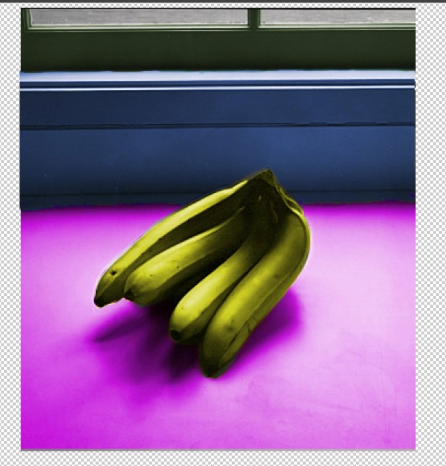
This was great fun. I had a problem with the copy and paste as the image was not directly in the same place. This was when the selection was made, using the layer mask option and reselecting the standard mode then needing to copy and paste the selected image into a new layer Before using the magic wand to select and then inverse the image before colouring. The last image in the about sequence is an example, I moved the image to position it correctly.
